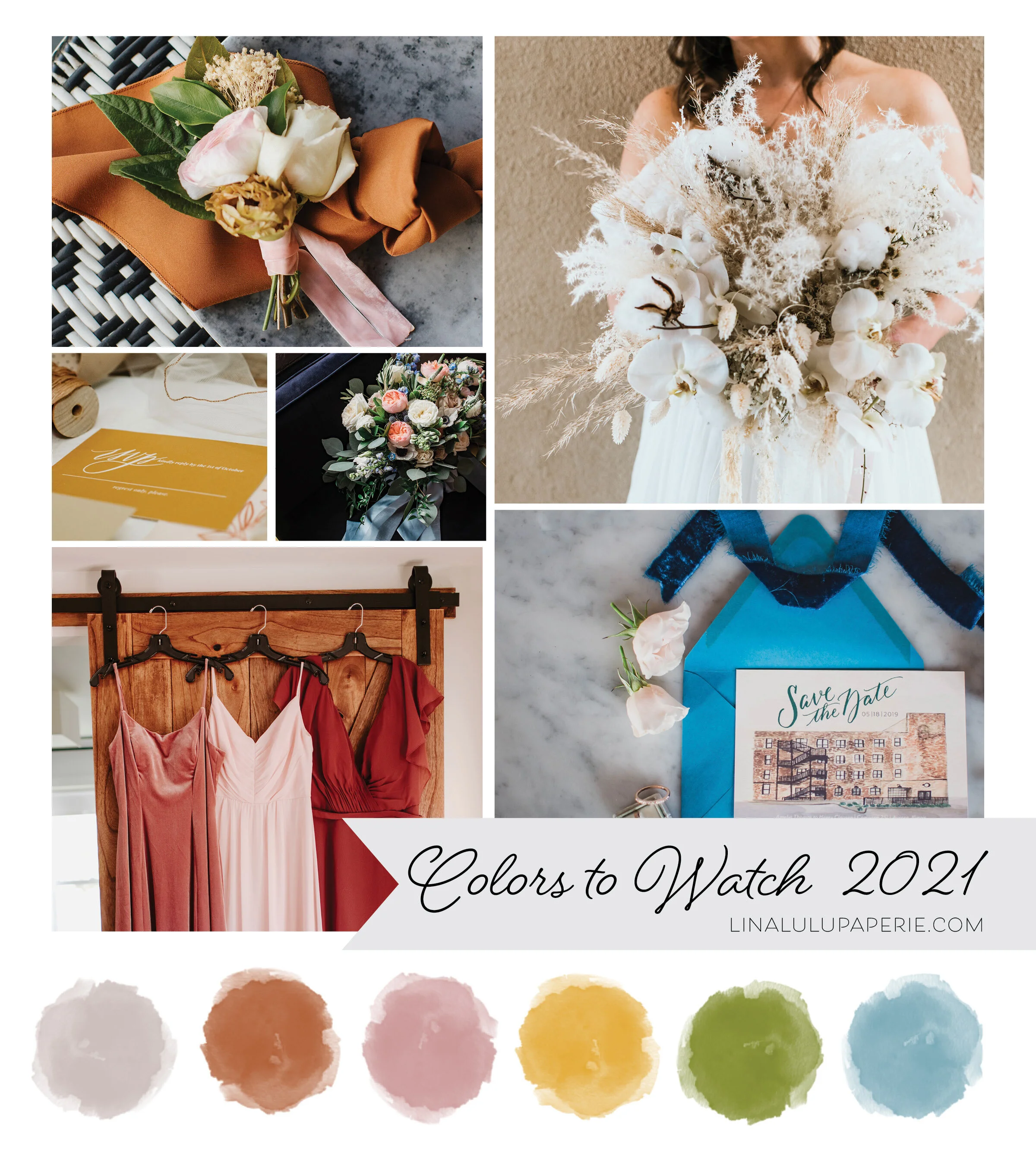
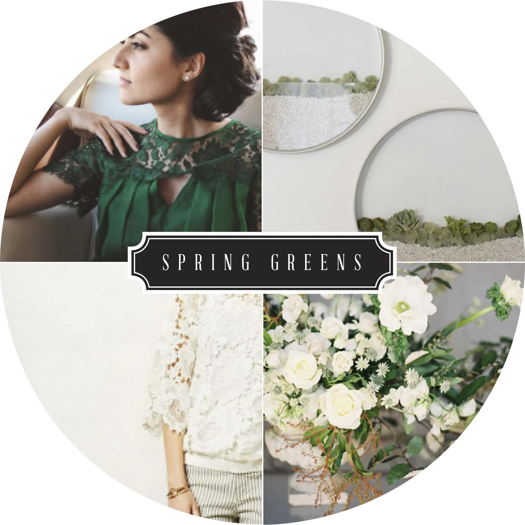
Photos starting top Left Column: Boutonnière florals by Izzy & Co. Photography | RSVP by Lina Lulu Paperie | Florals by Elisabeth Dari | Bridesmaid Dress Photo by Teresa Williams | Organic Florals photo by Teresa Williams | Save the Date by Lina Lulu Paperie and Photo by EV Photography
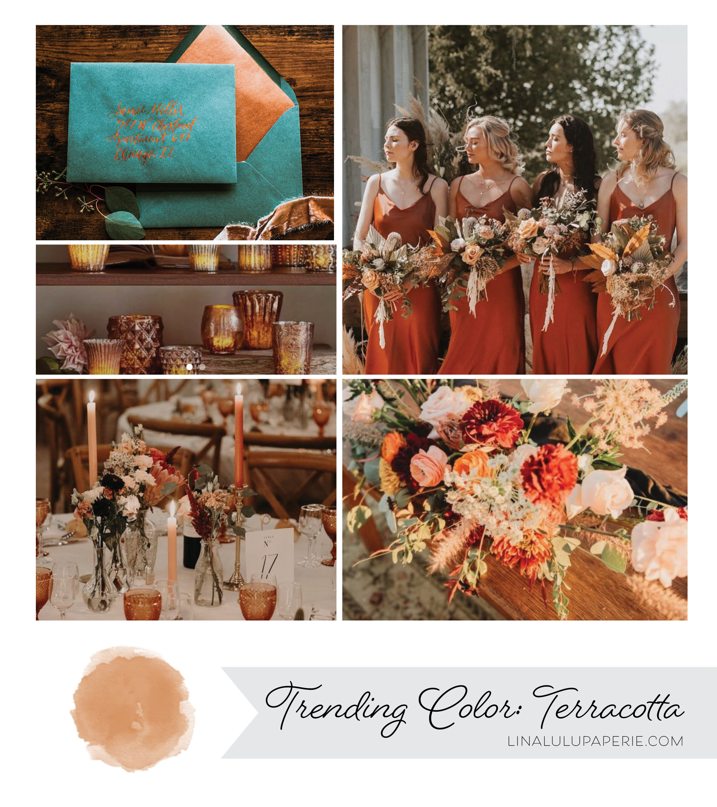
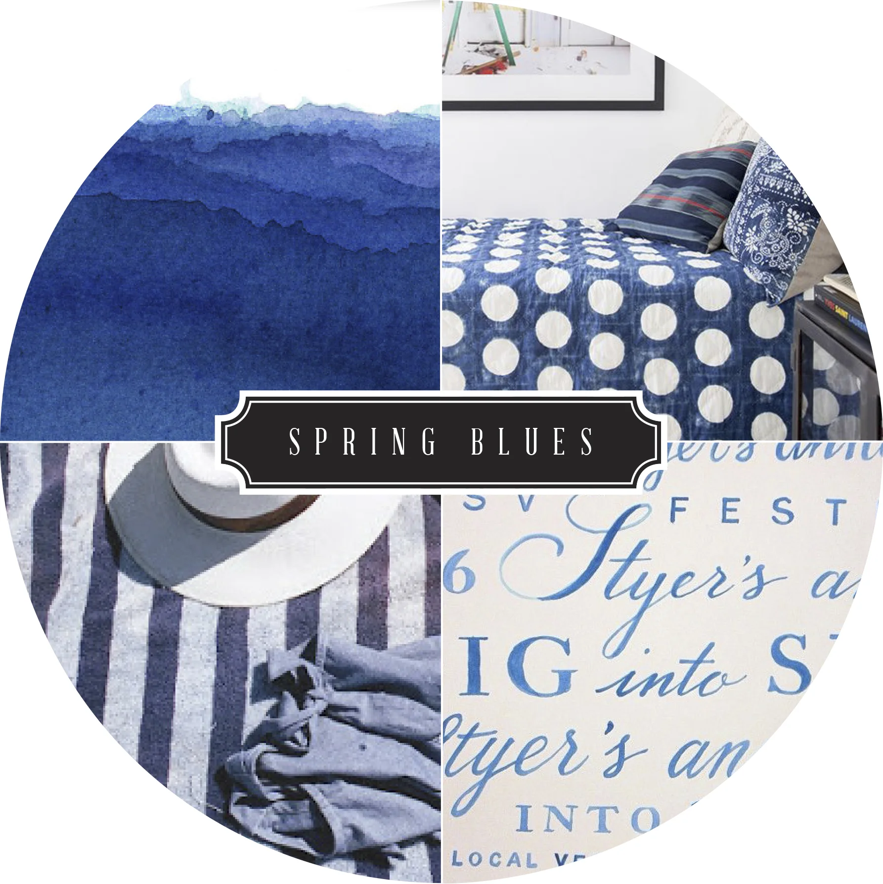
I am in love with the color trends emerging for late 2020 and forecasted for 2021 weddings! We will continue to see beautiful earth tones with such colors as Terracotta, Warm Grey, Hazy yellow and Sage Green through out all the seasons. Neutrals, I believe, will continue to dominate in the winter and spring weddings with a mix of off-white colors complimented against beige, grey and pale pinks. For late spring and summer wedding colors found in nature will be back in vibrant hues including airy blues, shades of greens, and a mix of purples and soft pinks to bring in the feminine, romantic feel that comes with those long summer nights.
What do you think will be popular this upcoming year? Do you think neutrals will be gone by the time Winter 2021 comes? I’d love to hear your opinion or what colors you have picked for your wedding!


