Portfolio: Longyne/Smies Wedding

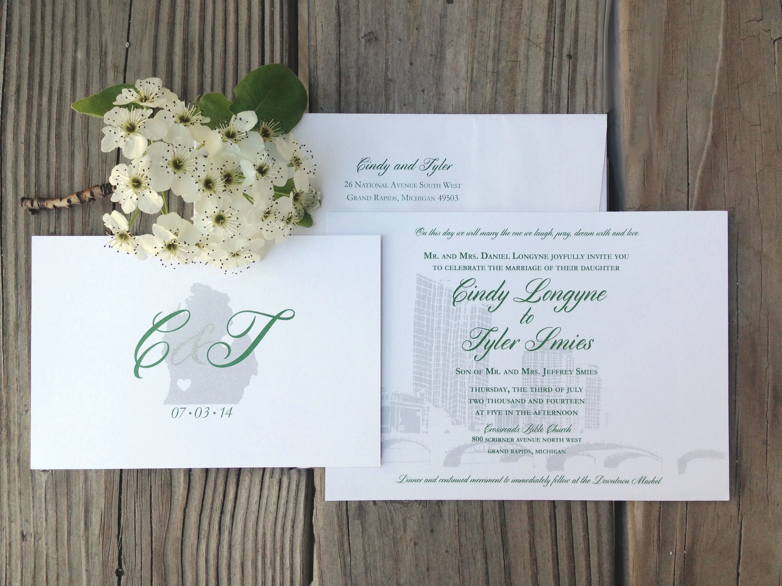
A few months back I had the pleasure of illustrating a beautiful, city inspired wedding suite for Cindy, and husband-to-be, Tyler. You can see the mini moodboard here I created when beginning this project.

CT_02.jpg

I loved hearing the passion that Cindy and Tyler have for the city of Grand Rapids, MI and how it has played a role in their relationship - and now in their wedding! We went with dark green and a grey metallic inks to bring out the scheme of their wedding. I love how the metallic ink shimmers and makes the city feel alive in the background.

Best of luck you two - I know the Lord has much in-store for you in marriage!


CT_invitetif.jpg

Portfolio: Forever Young Print

When my sister-in-law, Lindsay, was still pregnant we had talked about doing a calligraphy print for the nursery for baby to be. She brought up the song "Forever Young" by Bob Dylan. A personal favorite of mine, and such a sweet sentiment to hang in a nursery. Fast forward to February, and baby to be is the beautiful Olivia Mae!

My favorite line in the song reads "May you build a ladder to the stars | and climb on every rung", and thus I chose the night sky theme. (Plus it gives me an excuse to work in gold ink). I love how it turned out, and love that these words will bless Olivia for years to come!

Portfolio: Lindsay's Baby Shower

Invite_ReiminkBaby.jpg

To celebrate my sister-in-law, mommy to be Lindsay and baby, my mother-in-law hosted an adorable baby shower in their honor! I was so excited to add my calligraphy to the (already) wonderful decor and joyous celebration.

Shower_Reimink.jpg
Shower_Reimink_04.jpg

Beth out did herself with her theme "She's about to Pop!"  by including all things "pop" worthy including cake pops, blow pop champagne "poppers", poppyseed muffins and so many other delicious treats!

Shower_Reimink_03.jpg

Portfolio: Aagaard Wedding | Invitation Suite

A while back I gave you a glimpse of the process I went through to come to this beautiful invitation suite, here and here.

KeithWedding_01.jpg

The bride was inspired by the mix of antique finds of her own and the bold mix of patterns seen at such stores like Anthropologie and J.Crew. With this in mind, we created a pattern and monogram that was repeated through out the suite.

InviteaCard.jpg
AagaardFullSuit.jpg

The finish product was a sweet mix of hand-done elements - like the screen printed booklet cover, and the engraved invitation- with an elegant simplicity to allow the importance of the text to shine through. The mix of the subtle but bold nature of the pattern on each piece gave a modern feel to this classic style of invite.

Portfolio: Aagaard Wedding | Sketches

Agaarod_Sketches.jpg

A few weeks back I shared this mood board with you from the lovely Aggaard wedding. You can see how the Mood board dictated the inspiration for the three comps I ended up showing the client. With details of a muted palette and a vintage but classic feel to the suits to match the rustic wedding she was planning, each suite captured a different mood we had talked about. The first having a contemporary look and a splash of watercolor to create color; the second being more straight cut classic, with modern vibes, and the third being a clean pallet of grey and white with a mix of patterns and vintage fonts. In the end we mixed and matched pieces from each set to create the final suite she had envisioned from the beginning. I can't wait to show you how it ended up!

Portfolio: Voss Wedding Program

Front Cover to Matt and Corrie's program.

Front Cover to Matt and Corrie's program.

A sweet friend of mine, Corrie, asked me this past summer if I could help her out with the programs for her wedding. Although I didn't design her (very cute) invites, I had the opportunity to help her continue the theme and design in her programs.

It was fun to find the perfect way to display this sweet and loving couple's personality and gratitude through a tri-fold, square program that features the bridal party at the heart of the inside. Their wedding colors of corral and navy blue as well as the mix of script and serif font were a strong theme that Corrie had planned through out the rest of the wedding and the reception.

See more details of this fun program here 

Inside fold of Matt and Corrie's program

Inside fold of Matt and Corrie's program

Portfolio: Noah's Ark Coloring Page

Noahsark_Full.jpg

I recently worked on a fun project for work that I had a chance to use my illustration skills. The coloring page will be used for a Mothers of Preschoolers (MOPS) Conference, and will be a feature handout for the company promoting a new sticker line.

Below you can see the multiple sketches I created to complete the simple line drawing. The requirement was to have windows that would fit two square stickers of Noah's ark animals - and after figuring out what that layout looked like, the boat started to take shape. It was a fun to take a break from the strictly on-screen work and implement both hand done work with computer finessing - even playing around with handwritten type as an idea for the title. 


Sketches_NoahsArk.jpg

Portfolio: Aagaard Wedding | Moodboard

AagaardWedding_3.jpg

I wanted to share a little on a fun project I did a few months ago. The first part to any project is capturing the clients look and feel, i.e. mood, for what they have in mind for the end result. Some clients will have their entire vision already set and just need a designer to put together the details. For Carly, she had a great aesthetic eye, but needed a designer to create that finished product. She was fun to work with as she wanted a traditional invite, but with a unique twist. This allowed me to think outside the standard box, but keeping a classic touch.

Other details she sought out were looking for a muted palette featuring jewel tones,  and a vintage but classic feel to the suit to match the rustic wedding she was planning. The moodboard above was just a small collection to help set the tone of the suite, and I can't wait to share what we ended up creating!