Front Cover to Matt and Corrie's program.
A sweet friend of mine, Corrie, asked me this past summer if I could help her out with the programs for her wedding. Although I didn't design her (very cute) invites, I had the opportunity to help her continue the theme and design in her programs.
It was fun to find the perfect way to display this sweet and loving couple's personality and gratitude through a tri-fold, square program that features the bridal party at the heart of the inside. Their wedding colors of corral and navy blue as well as the mix of script and serif font were a strong theme that Corrie had planned through out the rest of the wedding and the reception.
See more details of this fun program here
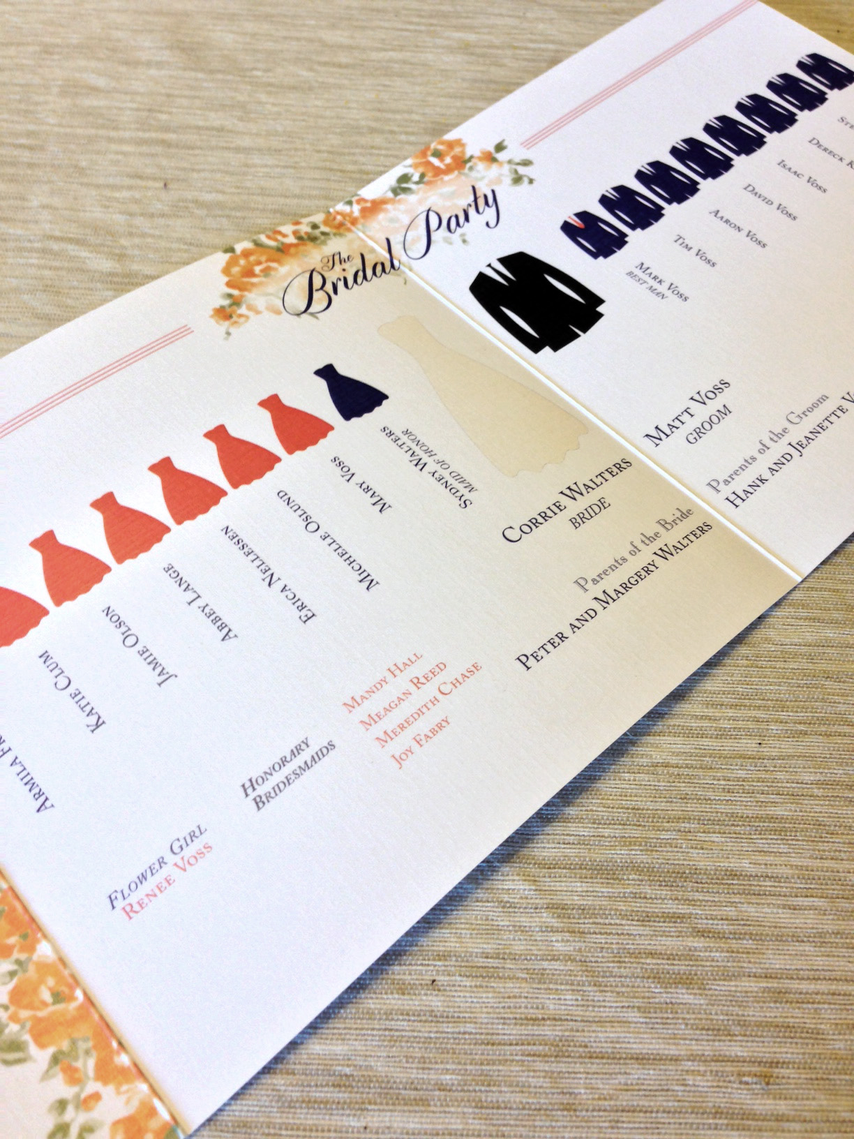
Inside fold of Matt and Corrie's program