Styled Shoot: Pink Lemonade at Bridge 410, Chicago

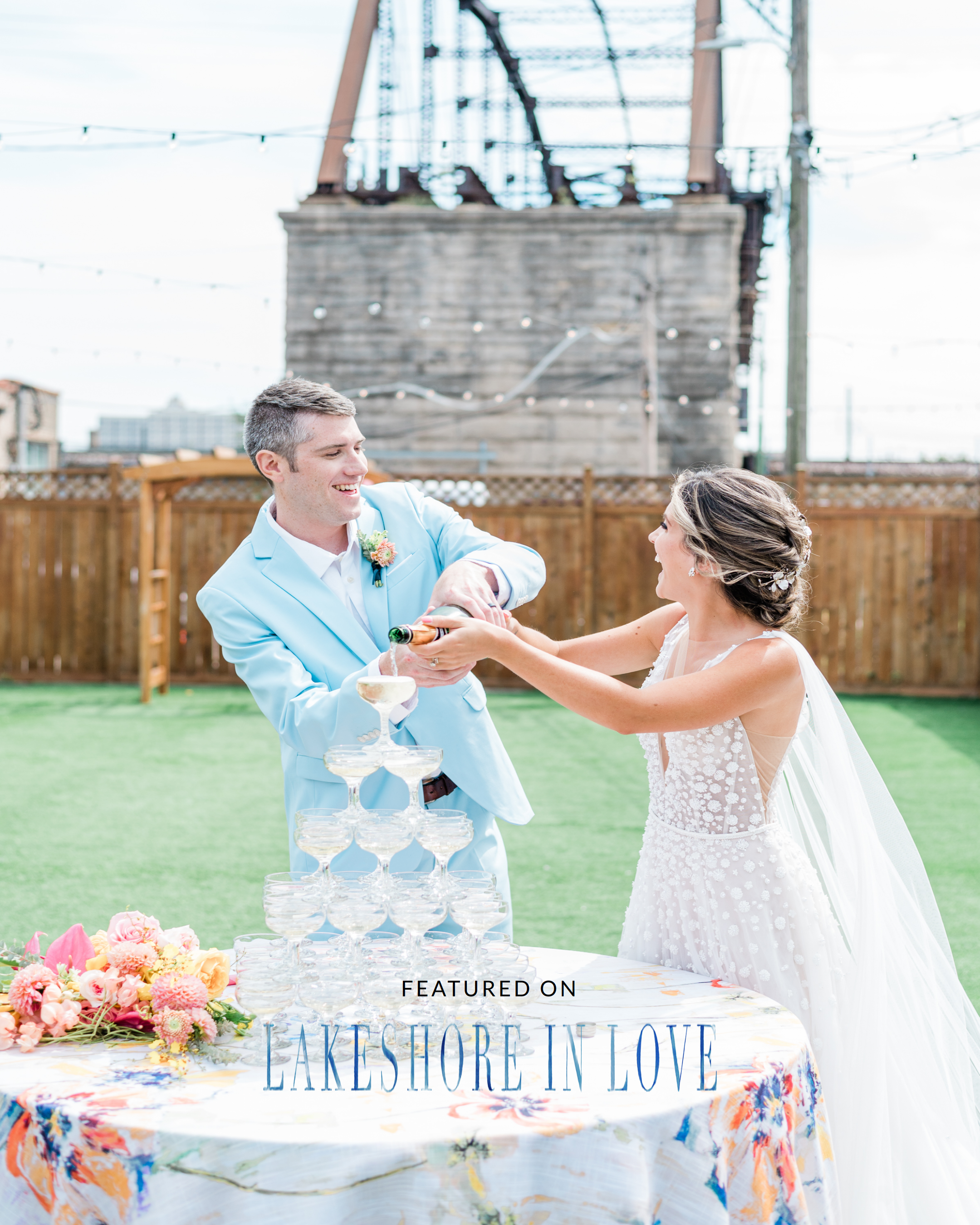
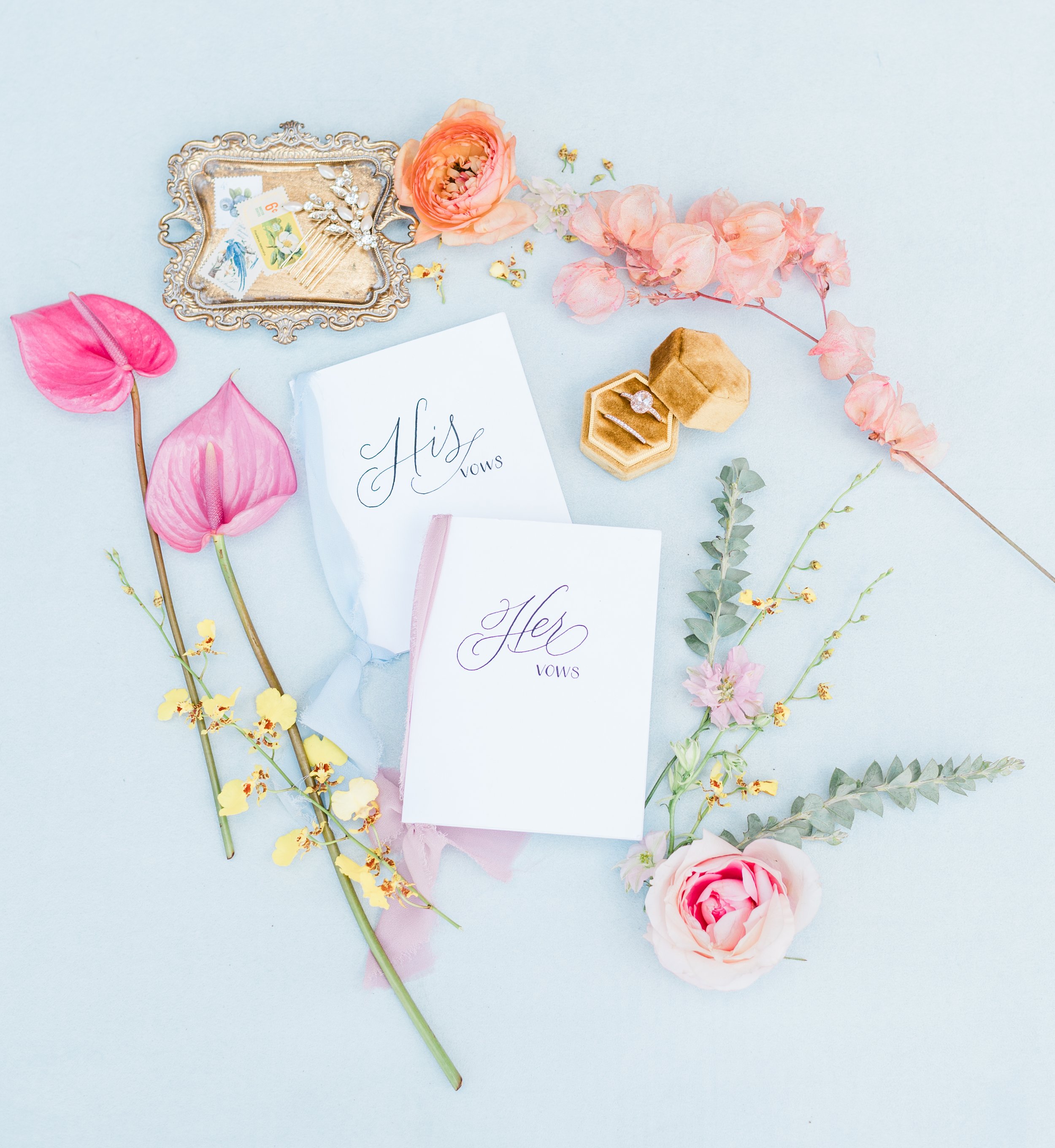
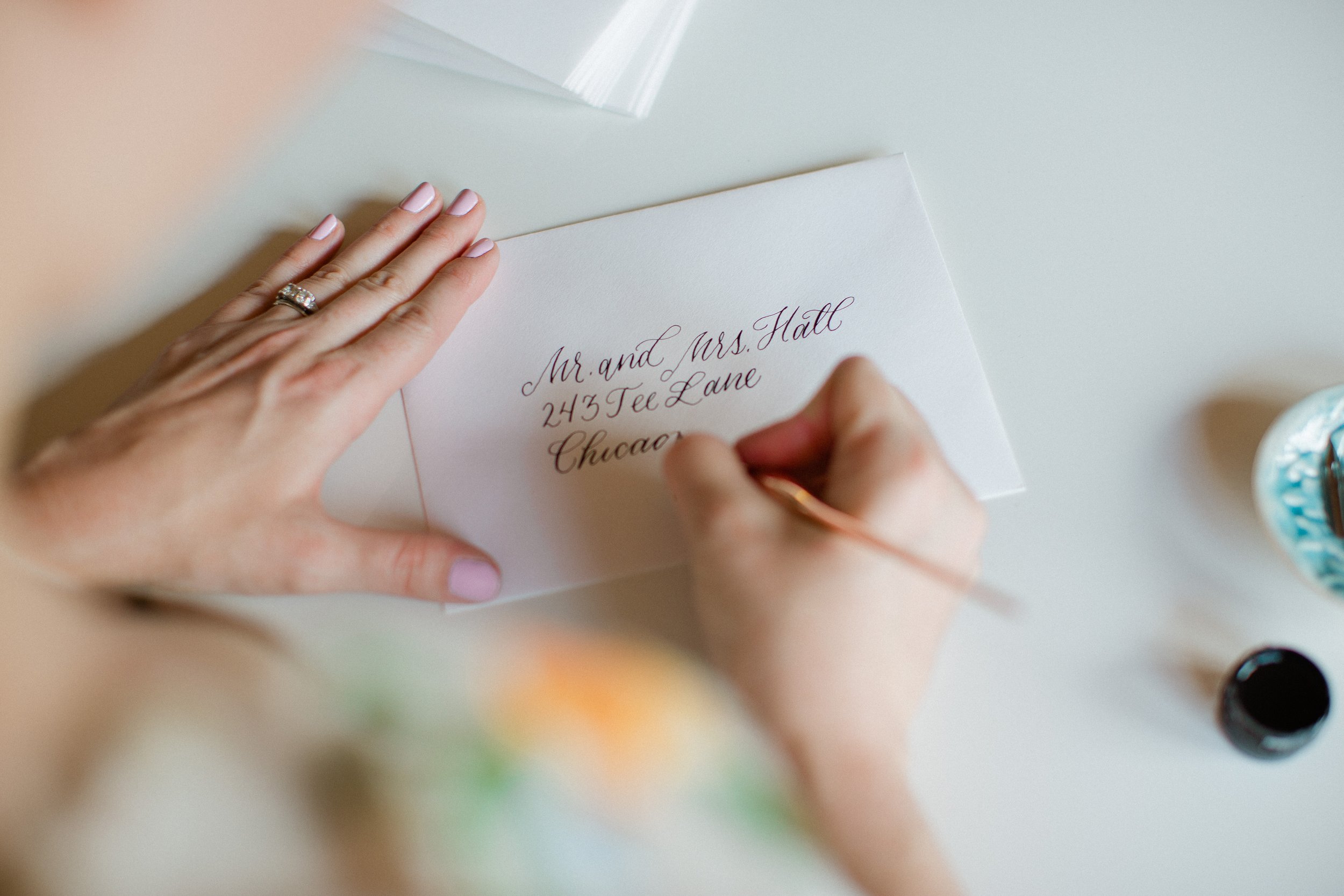
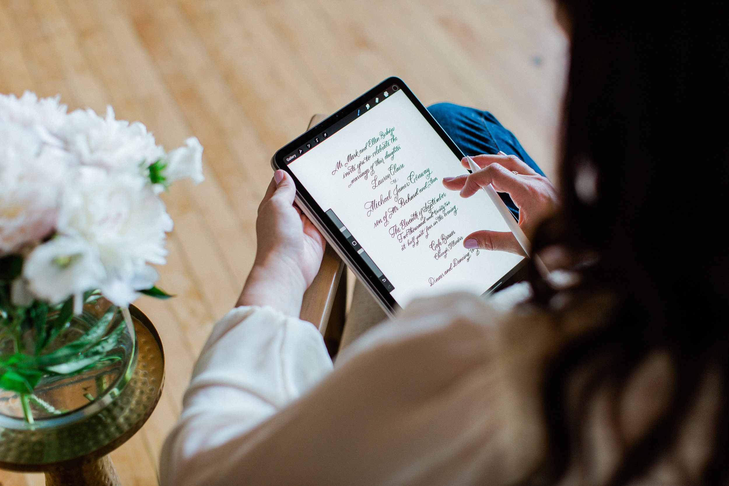
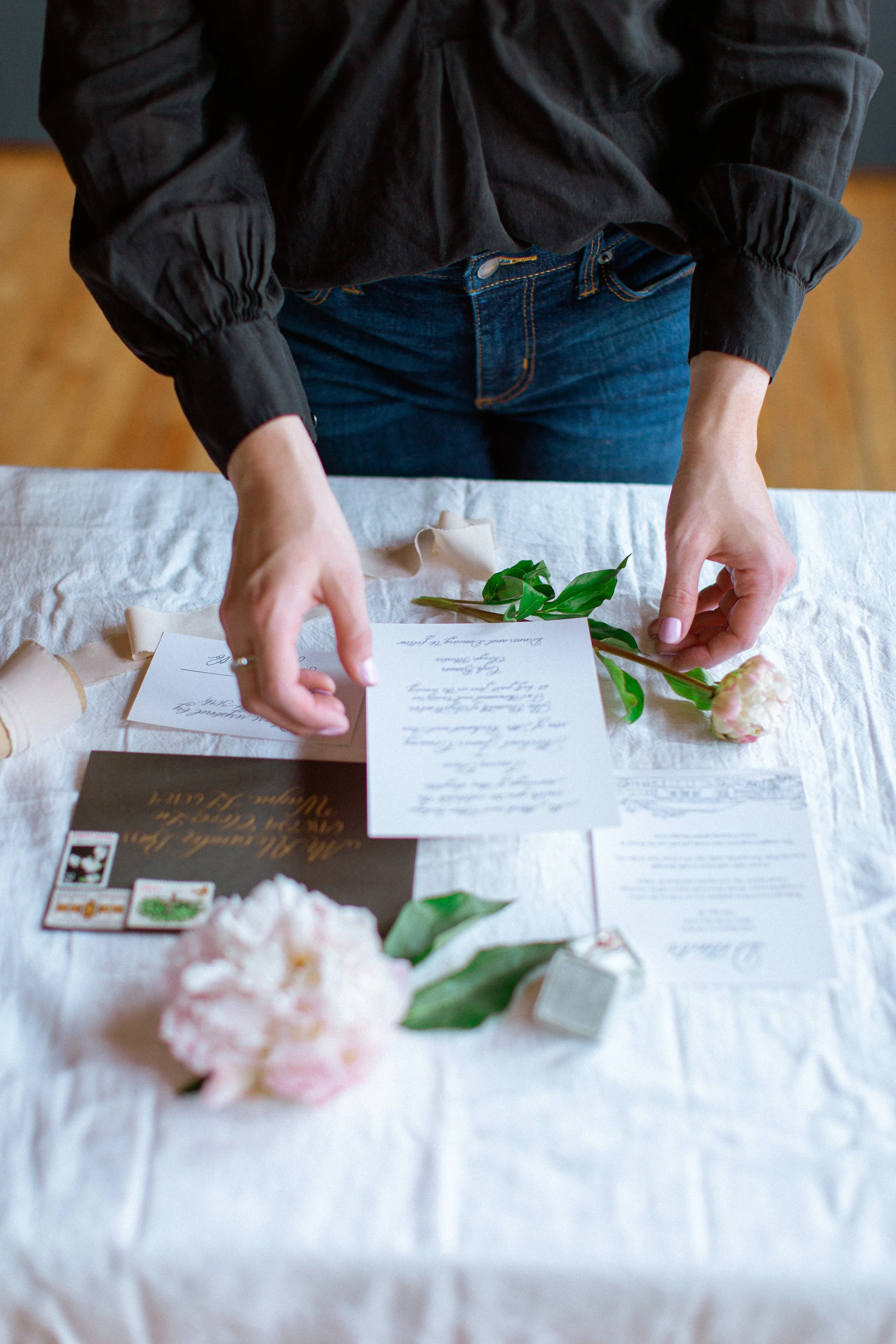
It is always a pleasure to collaborate with other wedding vendors for our clients weddings. It is just as fun to collaborate together on styled shoots of what we hope to see in the future trends for our clients. This shoot is no different! An incredible collaboration over all and I had so much fun dreaming up this invite suite for this colorful, city wedding!

AnamariaVieriuPhotography-PinkLemonade-Lakeshoreinlove-LinaLuluPaperie_Wedding_Stationer_Chicago_WeddingVenue_TheBridge410.jpg

Find all the images and more information on each vendor over on Lakeshore in Love Blog today!

Brand Refresh with Ness McCormick Photography

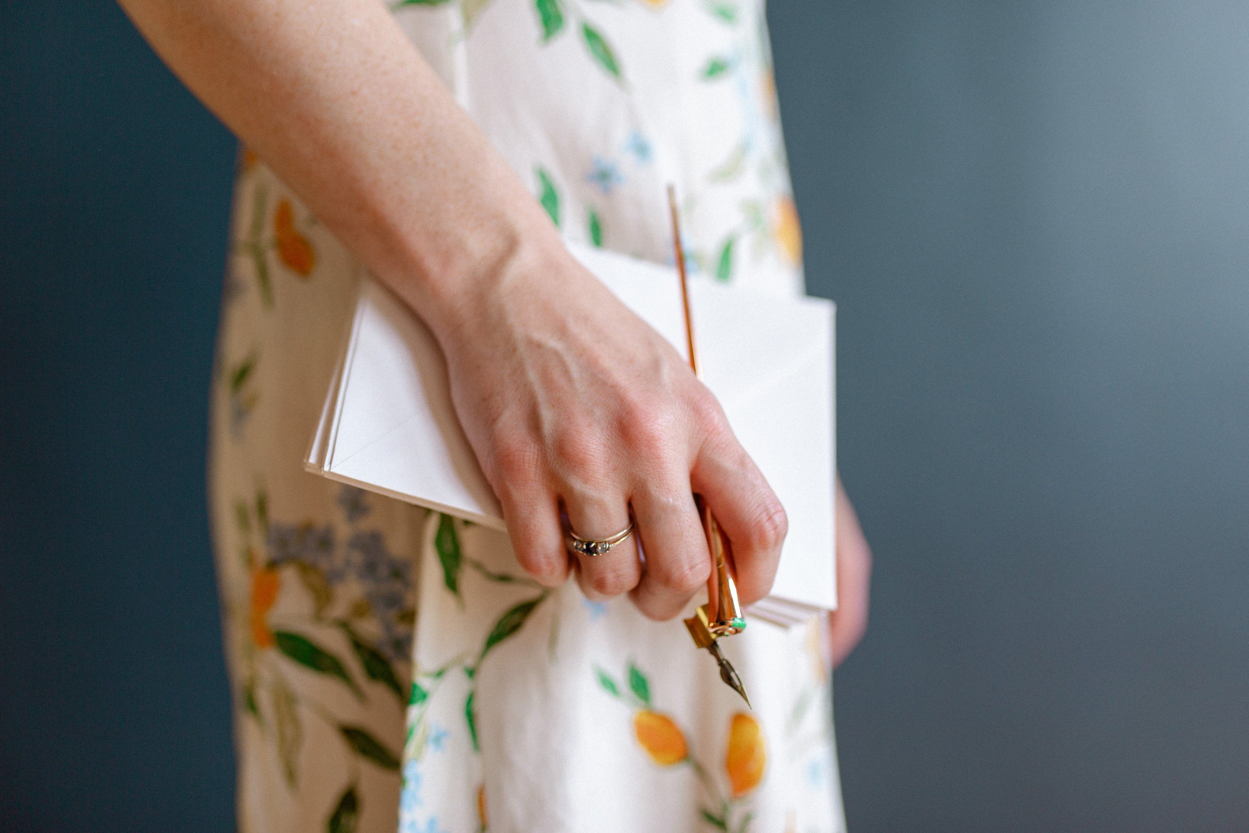
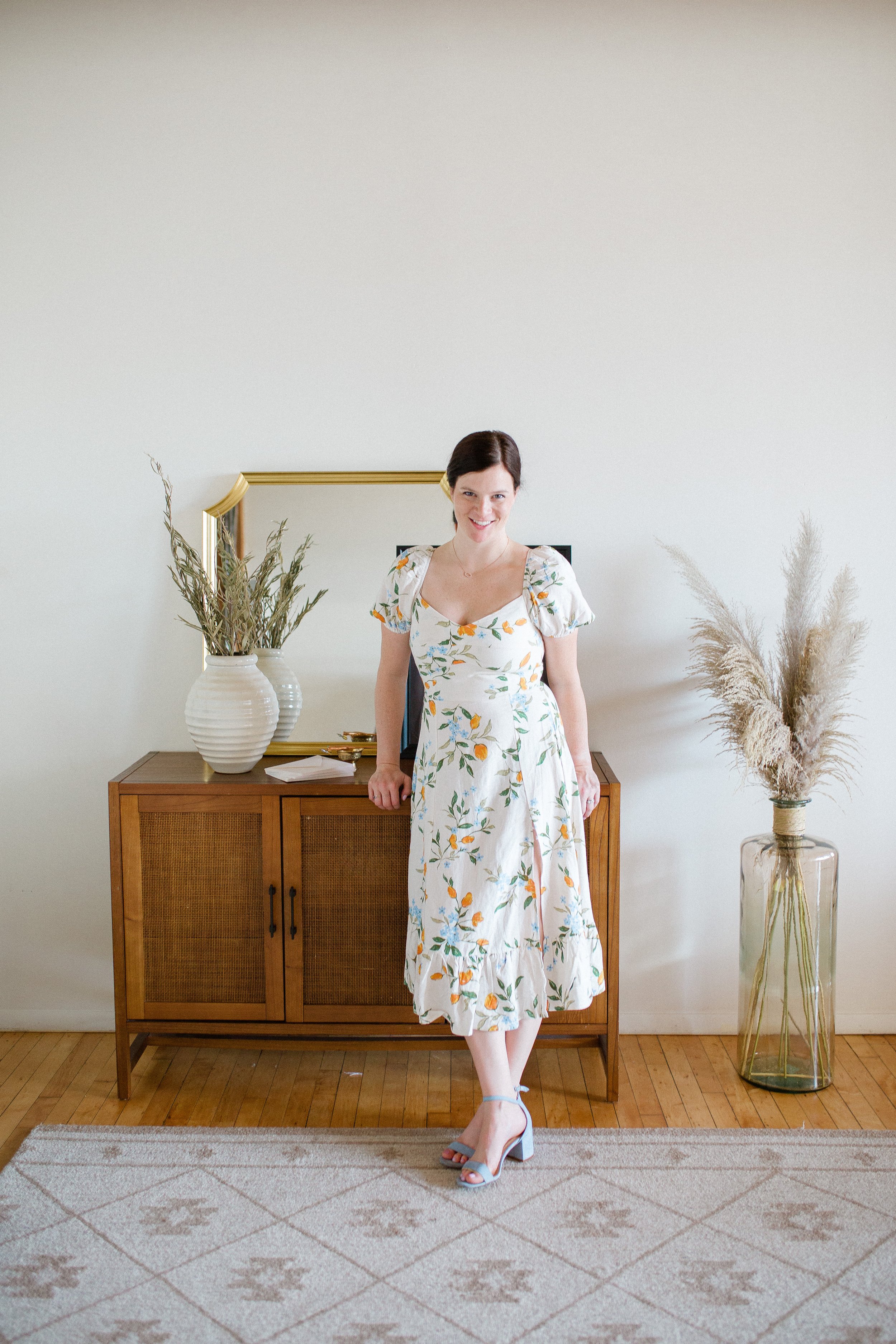
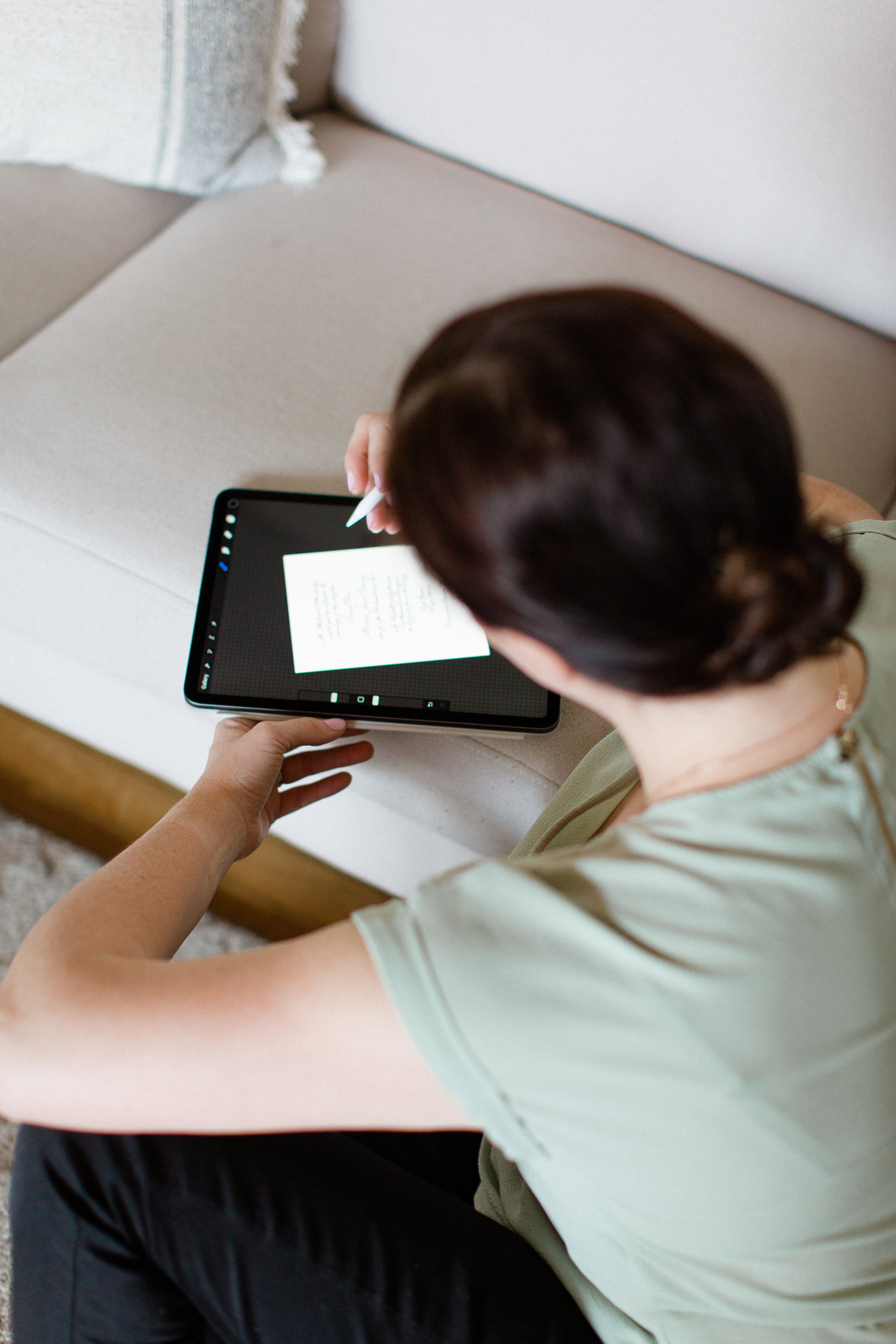
What is harder than choosing a new logo? Being a graphic designer who chooses to design and update their own logo! You may have noticed the updated LLP logo on the header of the website. Along with a brand and color refresh. I updated my headshots with a fun brand shoot with the wonderful Ness McCormick Photography this past Summer, and love how they turned out!

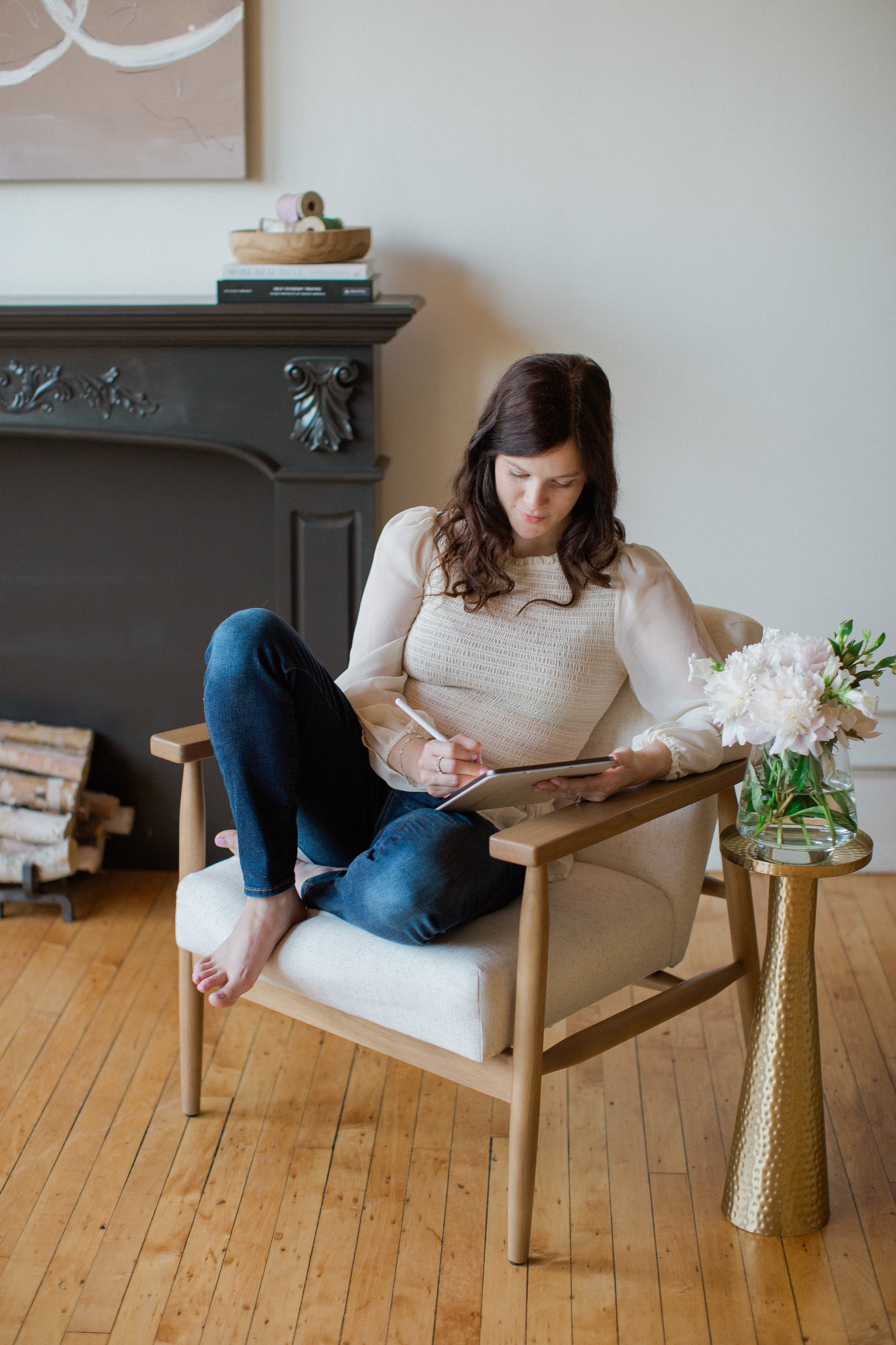
Caroline of Lina Lulu Paperie sitting at a desk, holding a calligraphy pen looking to the left.

The Big Fake Wedding, Chicago: Inspired By Morocco

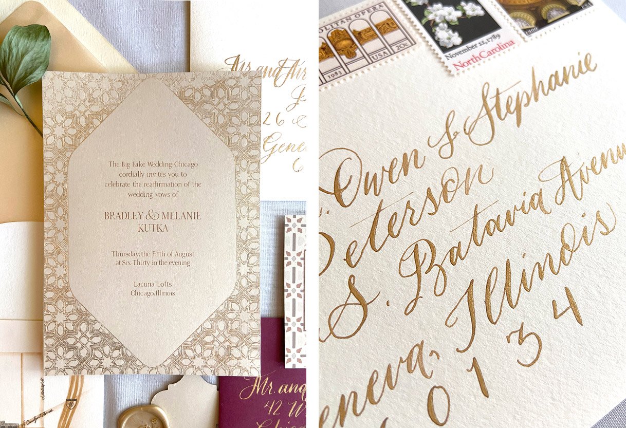
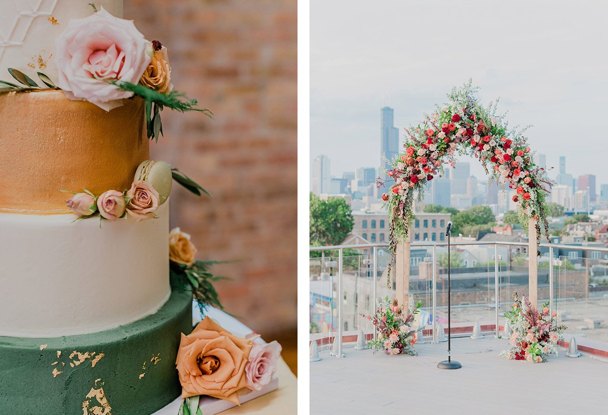
On a warm August night, a handful of vendors came together for a gorgeous vow renewal on the rooftop of Lacuna Lofts under a gorgeous floral arch.

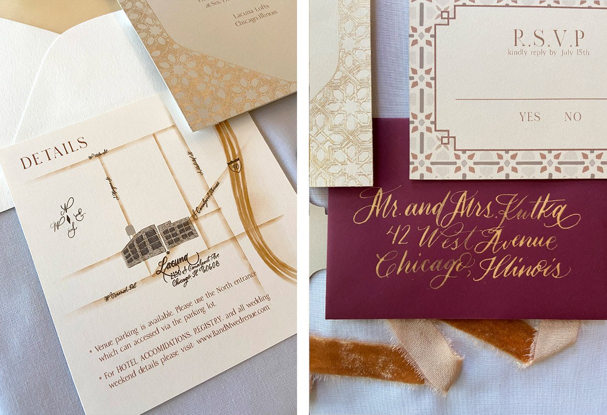
The invitations and paper good were inspired by traditional Moroccan patterns and colors as well as the lush colors of the florals. I loved getting to pull in warm tones to a lighter palette with the contrast of a deep wine color as the RSVP envelope. To add a hint of glamor and a little more elegance, the calligraphy is done in a metallic gold with the invitation foiled in a warm gold.

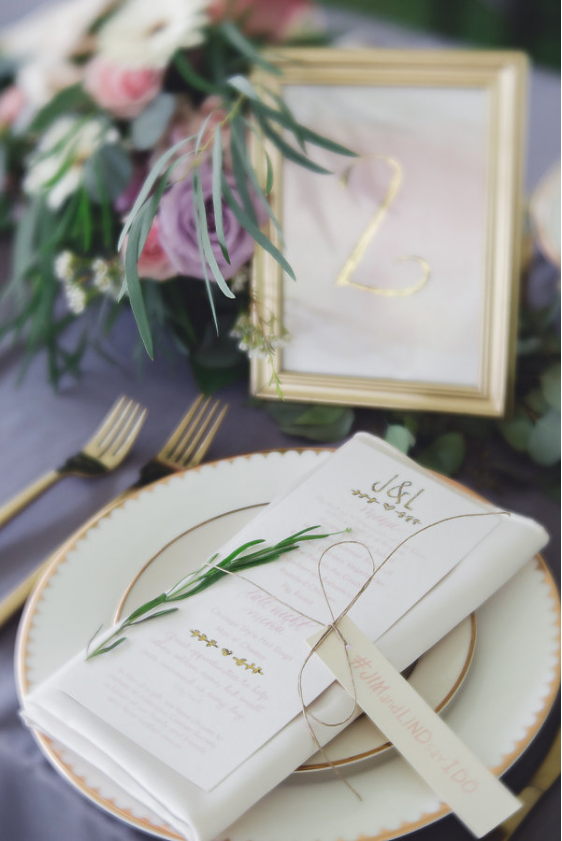
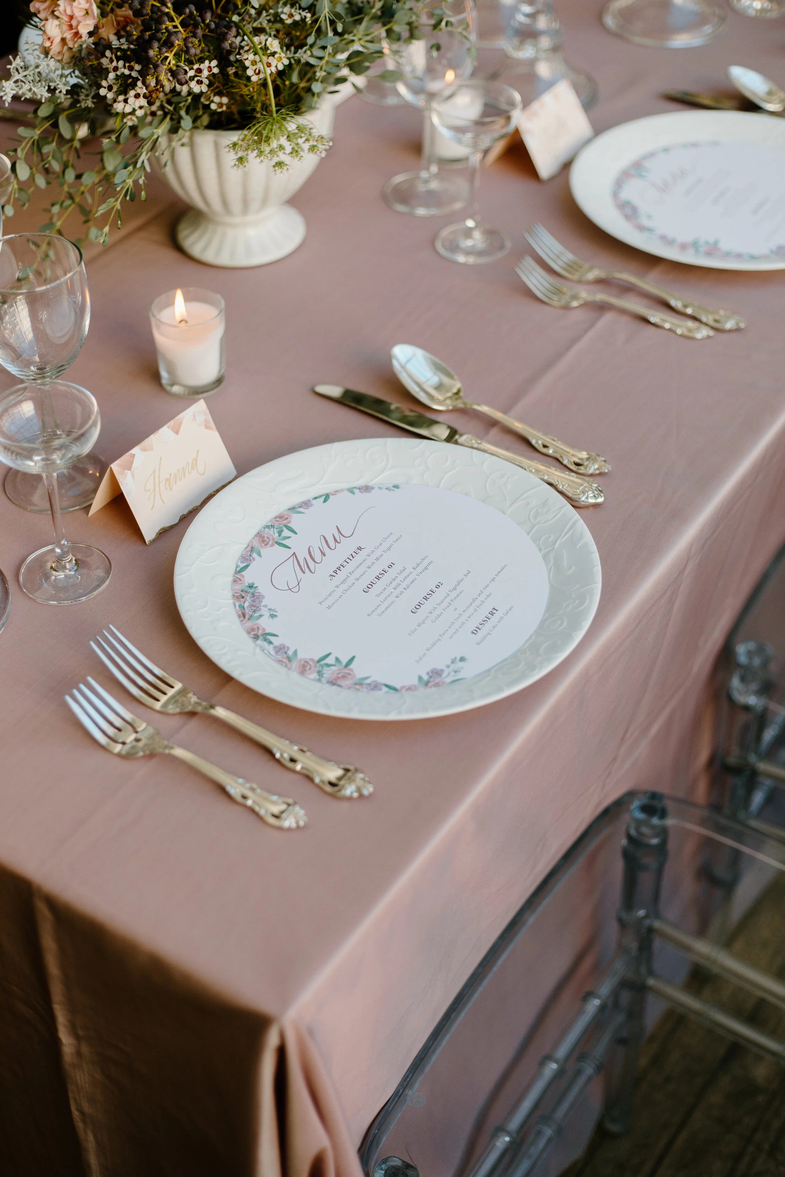
The theme continued on the beautiful table scapes with arched menus in the same sand color pulled from the invite palette with mimicked arched acrylic placards, bringing in a pop of green to this already stunning table.

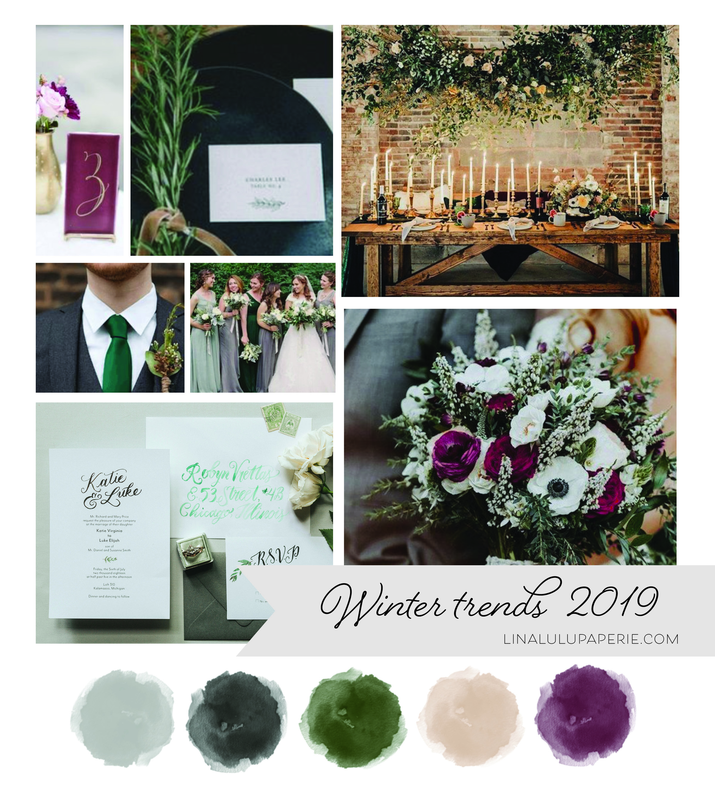
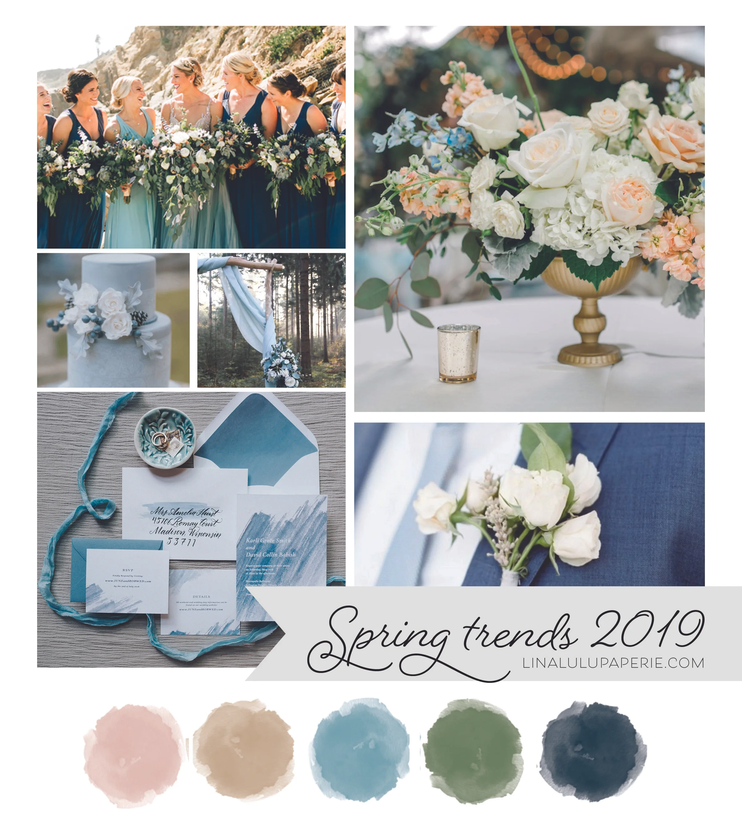
Trending Wedding Colors : 2021

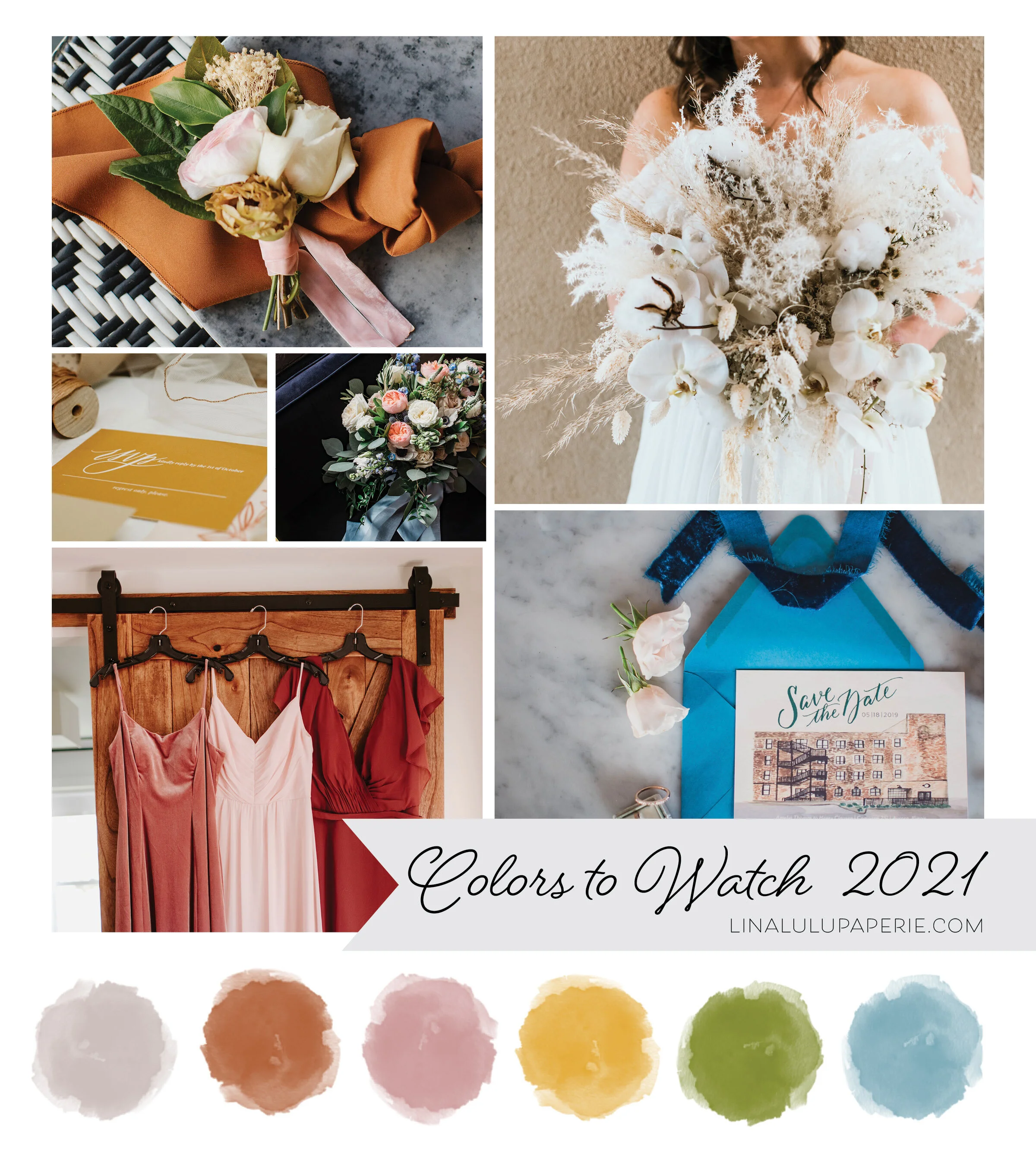
Photos starting top Left Column:  Boutonnière florals by Izzy & Co. Photography   | RSVP by Lina Lulu Paperie | Florals by Elisabeth Dari | Bridesmaid Dress Photo by Teresa Williams | Organic Florals photo by Teresa Williams | Save the Date by L…

Photos starting top Left Column: Boutonnière florals by Izzy & Co. Photography | RSVP by Lina Lulu Paperie | Florals by Elisabeth Dari | Bridesmaid Dress Photo by Teresa Williams | Organic Florals photo by Teresa Williams | Save the Date by Lina Lulu Paperie and Photo by EV Photography

I am in love with the color trends emerging for late 2020 and forecasted for 2021 weddings! We will continue to see beautiful earth tones with such colors as Terracotta, Warm Grey, Hazy yellow and Sage Green through out all the seasons. Neutrals, I believe, will continue to dominate in the winter and spring weddings with a mix of off-white colors complimented against beige, grey and pale pinks. For late spring and summer wedding colors found in nature will be back in vibrant hues including airy blues, shades of greens, and a mix of purples and soft pinks to bring in the feminine, romantic feel that comes with those long summer nights.

What do you think will be popular this upcoming year? Do you think neutrals will be gone by the time Winter 2021 comes? I’d love to hear your opinion or what colors you have picked for your wedding!

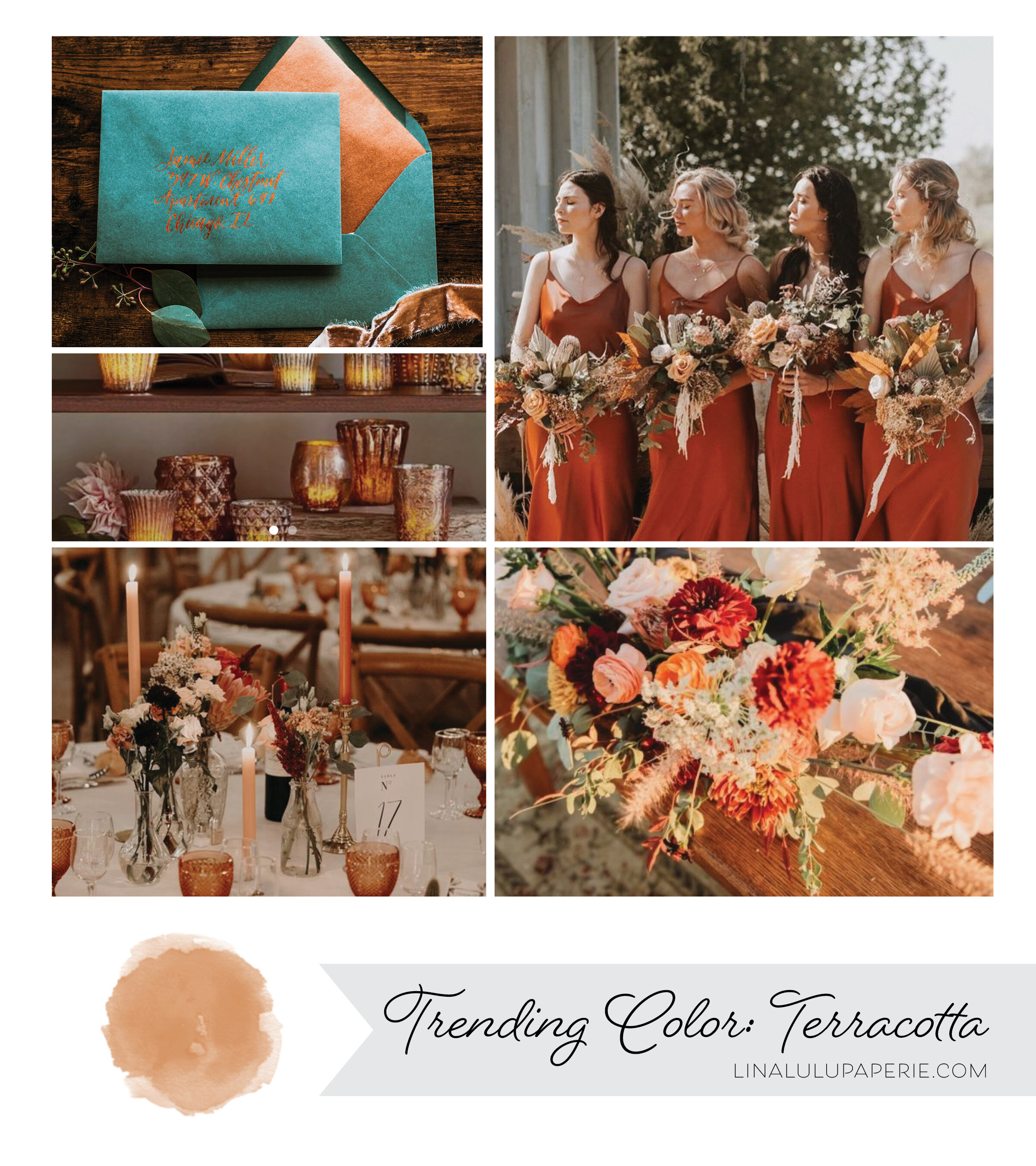
Trending Wedding Colors: Terracotta

Stationery by Lina Lulu Paperie | Candles from Pottery Barn | Table Scape by Sweet Blossom France | Bridesmaid Dress Photo by StoreEnvy | Rustic Florals from Bridal Musings

Stationery by Lina Lulu Paperie | Candles from Pottery Barn | Table Scape by Sweet Blossom France | Bridesmaid Dress Photo by StoreEnvy | Rustic Florals from Bridal Musings

With the Fall weather around the corner and the hopes of planning weddings in 2021, this beautiful color is one you will keep seeing for sometime. I have personally have loved Terracotta for a long time, even desiring it for my own wedding back in 2012. In the last year this minimal and earthy tone has been cropping up everywhere from clothing to home goods to the most envious of chic weddings. This natural, earthy color is always a winner and will instantly create an elegant boho vibe in any setting .

Thinking about using this color for your own wedding? I recommend staying on the earthy side of colors by pairing it with lush greens, creamy whites and copper for a bit of shine. Are you wanting a few more colors on the pallet? Add a dusty rose or a deep wine/maroon to play off the red undertones of this orangey hue.

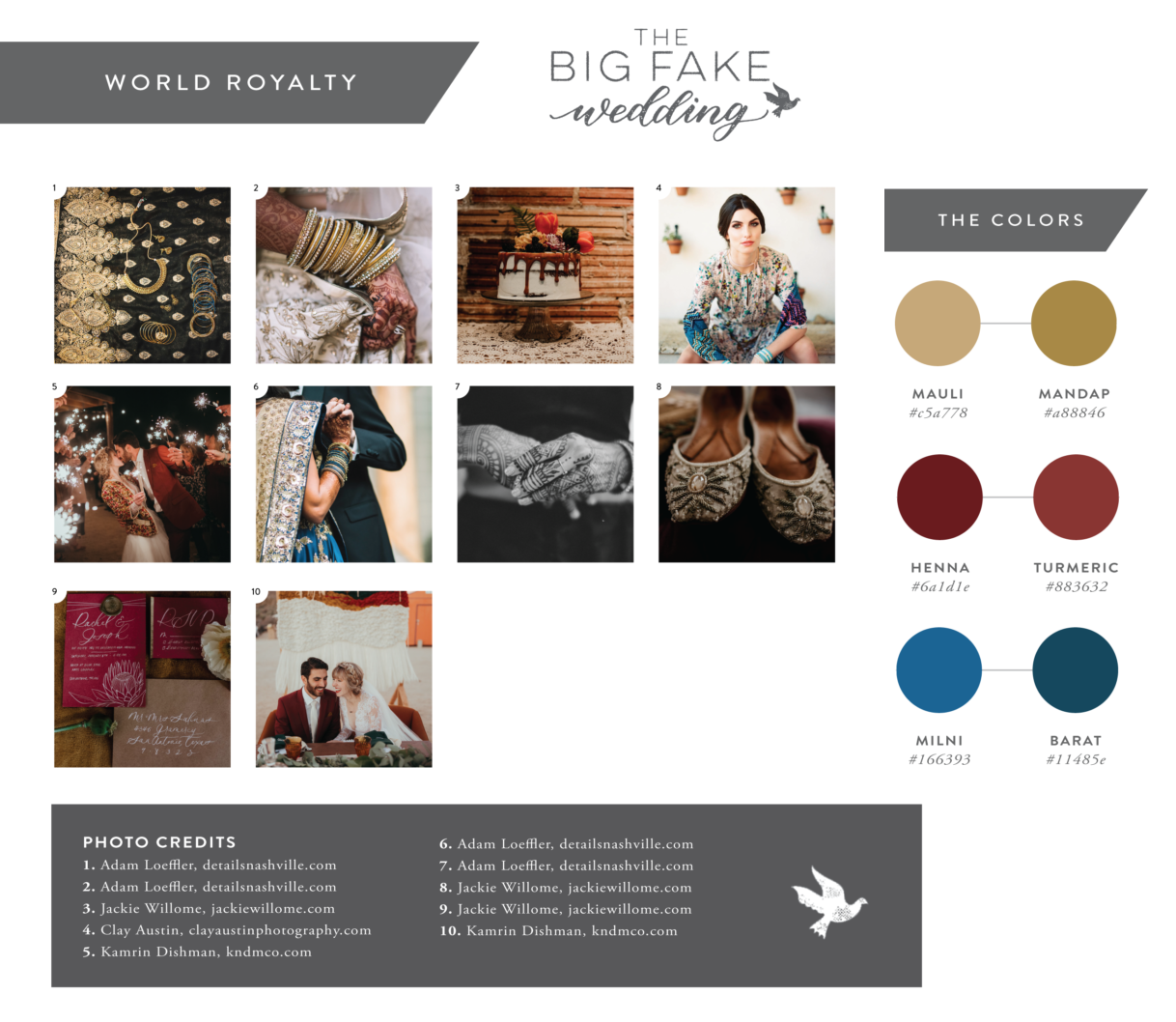
The Big Fake Wedding: Chicago 2018

When I heard about the Big Fake Wedding, I immediately thought about when I was a bride planning for my own big day. Being younger in age as a newly engaged bride-to-be, I hadn't attended many weddings with the mindset of what I liked about them and if I would repeat anything for my own day.

The concept of the Big Fake Wedding is so simple and smart. They come to a city, gathering talented local vendors and “create an experiential opportunity for wedding vendors to showcase their products and services to shopping brides and grooms just as they would at a real wedding.” You get to see the wedding in the form of a vow renewal ceremony and the reception complete with drinks, DJ and dancing. The best part s if you like something you see, taste or hear you can talk to the vendors who created it right then and there! How cool is that?

Each city is a different theme and experience for the couples attending, and Chicago did not disappoint. With the theme of “World Royalty” and pulling from beautiful, rich tones—there was so much inspiration to play with! Check out how the day pulled together over all:

unnamed.png

The venue was the beautiful Zhou B Art Center owned and founded by two Chinese brothers, both incredible artist who rent out the space for art exhibits and events. This industrial and chic venue was full of charm and some seriously beautiful art.

Elizabeth Greve Photography

Elizabeth Greve Photography

Elizabeth Greve Photography

Elizabeth Greve Photography

My role in this big day was one of two invitation designers. With such a rich color scheme and moodboard full of pattern and texture to work from, I knew that I wanted to do something more elevated than a standard invite to incorporate these elements. After deciding on this beautiful paper cut folder in a rich gold to house the invitation suite, I wanted to incorporate each color in a unique way on the rest of the accenting pieces.

Blending the free strokes of the watercolor with the formality of the calligraphy created the perfect mixture of classic and modern that would be represented in both the venue and the elements of the wedding day overall. I loved how this suite represented the theme in a chic way!

Elizabeth Greve Photography

Elizabeth Greve Photography

Thais Photography

Thais Photography

The day flowed like a real wedding, complete with photos of the “bridal” party, ceremony and reception. The bride and groom who modeled for the day performed a vow renewal during the ceremony portion including their pastor, real friends and family in their “bridal” party.

It was a beautiful ceremony complete with string quartet playing a custom arrangement as the bridal party walked down the aisle and an incredible copper arch with lush florals serving as the backdrop for the bride and groom’s ceremony. The reception was full and fun with fantastic appetizers, desserts and specialty mixed drinks. The bride even performed a special choreographed dance mid reception!

Thank you again to the team at The Big Fake Wedding for having me, it was such a fun party to be apart of and incredible to meet so many wonderful couples!

Thais Photography

Thais Photography

Elizabeth Greve Photography

Elizabeth Greve Photography

Elizabeth Greve Photography | Mila Craila

Elizabeth Greve Photography | Mila Craila

Elizabeth Greve Photography

Elizabeth Greve Photography

Cakes & Catering SOCIAL sparkling wine @socialsparklingwine

Favors & DetailsThe Standard Canvas @TheStandardCanvas

Groom & His MenBlank Label @blanklabelclothing

Bridesmaid Dresses Brideside Jewelry European Jewelry @europeanjewelryinc

Photo Booth Smilebooth@smilebooth

Cake ParfaitsVanille Pattisserie@vanillechicago

Day Of CoordinatorWedicity. DJ & EmceeCharizma Entertainment Group

Floral & Event Design: Bouquets, Boutonnieres & Tables 5,6,7 Eden

Floral & Event Design: Ceremony Backdrop & Tables 1,2 Nightshade Floral

Floral & Event Design: Flower Wall & Tables 3,4 Crafts By Stacey @craftsbystacey

Hair Styling Carrie Kacen Hair and Make-up Artistry @carriekacen

Hotel Accommodations W Hotel @wcitycenter

Invitations The Paperie Co @thepaperieco | Lina Lulu Paperie @linalulupaperie

Craft Cocktails CraftYours @craftyours

Makeup Artist Fearless & Bella @fearlessandbella

Marshmallow Favors Malvi: Marshmallow Confections @malvimallow

Catering LM Catering @lmcateringchi

Seating Chart, Custom Drawing, & Paper Goods XO Art & Design @xo_artanddesign

Dance Lessons Windy City Wedding Dance @windycityweddingdance

Photo Magnets Flash Magnets @flashmagnets

Ceremony Musician Bridge and Bow Music

Wedding Registry Mishkalo@mishkaloregistry Wedding Cake ECBG Cake Studio

Signage & Custom Jackets KRorerDecor @krorerdecor

Sparkling Water Spindrift Cookies Warm Belly Bakery @warmbellybakery

Table Accents The Blonde Scribe @theblondescribe

Travel Agent LovinAway @lovinaway

Photographers Thais Photography @bythaisphotography | Mila Craila Photography @milacrailaphotography | Elizabeth Greve Photography @egpwed

Venues Zhou B Art Center @zhoubevents

Wedding Dresses Winnie Couture @winniecouture

Wedding Films Eyework Studios


Styled Shoot: Being Joy Photography at Venue 5126

I met Joy this summer at a local wedding gathering and instantly loved her spirit and vibe. I then proceeded to fall in love with her style and gorgeous photos! She invited me to be a part of an amazing team assembled to create a gorgeous boho inspired shoot  at Venue 5126 in Oswego, Illinois. 

BeingJoy_Suite_Shoot_02.jpg
BeingJoy_Suite_Shoot.jpg
Being Joy Photography-60.jpg

Finding the right mix of modern, boho, and romantic was my aim as I created a simple but sophisticated wedding suite for this shoot. A combination of hand drawn botanicals, calligraphy and gold embossing become the perfect mix to produce a wild and tame feeling all in one.

Being Joy Photography-50.jpg

The Incredible Vendor team included: Photography, Being Joy Photography  | Venue and Props, Venue 5126. | Flowers, Ashland and AddisonRJPdesigns | Gowns, Victoria Sdoukos Couture. | Hair, Hair By Dorthi. | Make-Up, Alana G | Models, Gabija Guzauskaite and Whitman Johnson

Dream Patio

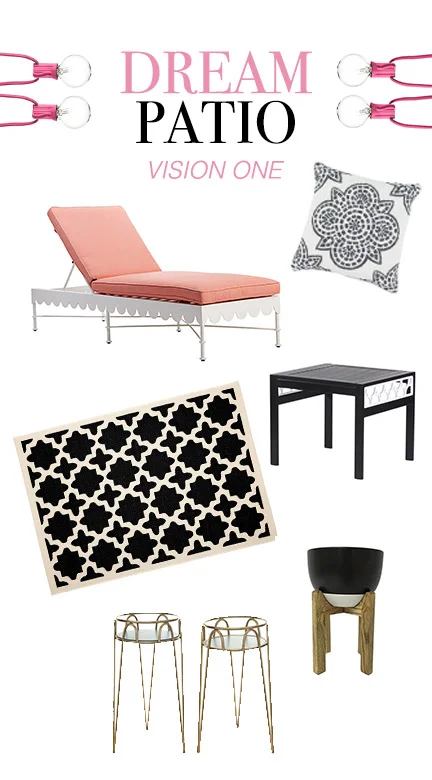
Summer is so close! With our move to a new apartment last Fall we gained a patio space. I must say this was one thing I felt was lacking in our old apartment. With the days getting warmer, I can't stop dreaming about what our patio will look like and spending time there! Here are a few dream patios of mine...

I have been loving the fun black and white trend with a pop of color. I'll be honest, I don't love the color pink. Look at that lounge chair though! I love the scallops and the way it would pops with so many black and white accents. Just imagine the space filled with leafy palms and how the soft light would look at twilight bouncing off the gold plant stands. Dreamy!

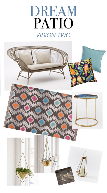
My second dream patio mixes fun patterns and the ease of the boho trend. Pulling in more bright colors, beautiful wicker lounge chairs, and teases of copper and gold—this space would be great for relaxing on any day of the week. I love the idea of hanging plants to give a "surrounded" feel to the patio, but creating more foot space. Wouldn't it also be fun to fill that pretty geometric lantern with fairy lights?

I'm still figuring out what would fit in our smaller patio space (as well as in our budget), but I'll keep looking around and combining my dream patios till I find my "can't part with "pieces. 

Links to Love: March 2016

Image by Robert Kutsaev for Unsplash

Image by Robert Kutsaev for Unsplash

March is here with the promise of Spring (maybe) in the midwest, and with Spring comes color! Here are a few links I have been loving so far in 2016 filled with color and beauty:

Jewelry with a cause, 31 Bits has an amazing Spring 2016 collection. I am in love with all their bright colors and designs. Any one else in need of their droplet bracelet collection right now?

As if you couldn't fall in love with Jessica Hische even more, read her 7 Truths for Creative Success here on the Minted blog.

Did you catch the Oscars this year? World famous photographer, Mark Seliger, is at it again with his instant Portrait Studio at the Vanity Fair after party. Among the stunners I particularly love how he captured Lady Gaga and Anne Hathaway.

Such a sweet DIY flower filled wedding—I love those colors!

When everyday objects match a favorite Pantone color, it's a good day. When tiny little objects match a Pantone swatch perfectly, even better. 

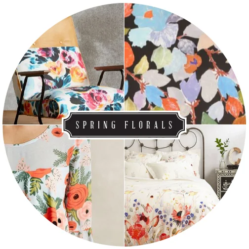
Color Companion : Spring Florals, Anthropologie

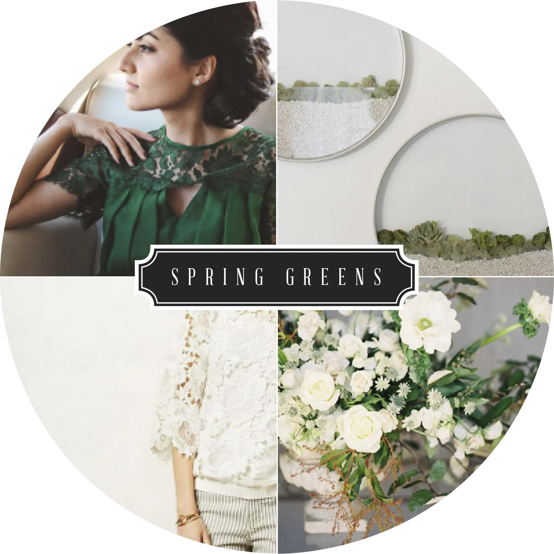
Flowers are great any time of the year and Springtime is their time to shine! I love the variety and stylization that floral prints take on. I couldn't narrow it down to  one type (because I love SO many!), I decide to narrow it down to one company. Anthropologie is dreamy unto itself, but then you add all the floral's and BOOM - a slice of paradise. I especially am excited for the Paper Crown & Rifle Paper Company collaboration line ( lower bottom left).
I love the variety of florals they always have in store. From their clothes to their home goods, everything looks good with a little floral splash - am I right?  How do you use florals?  Are they everywhere or do you limit them to just clothes?
Clockwise: Chair | Wallpaper | Bedspread | Dress

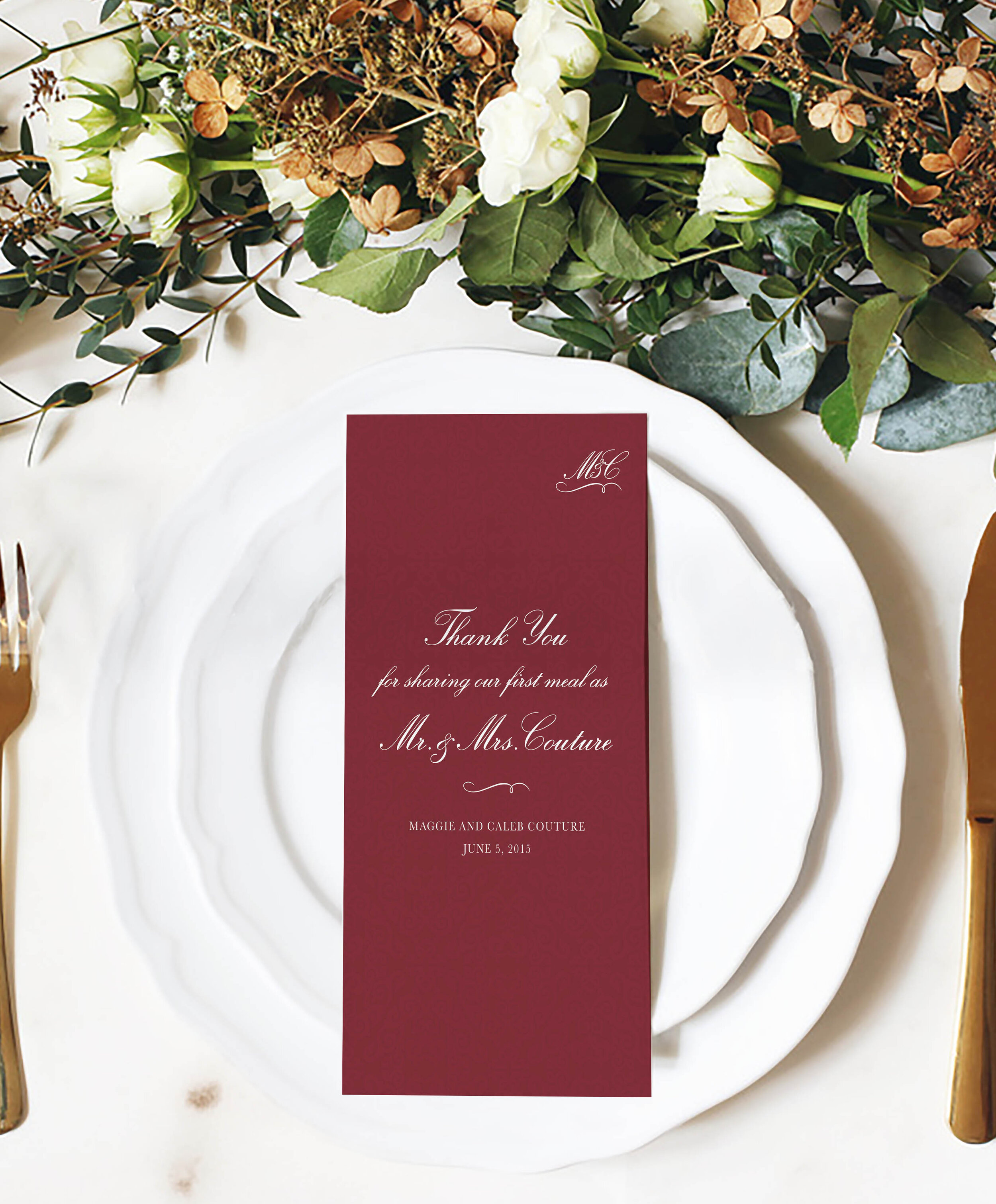
Color Companion: Marsala

Recently I have been seeing this deep wine, almost brown color in a variety of mediums - clothes, flowers, home goods, ect. Who knew that the actual color name was Marsala?
Regardless the name and the slight variations I have seen, I think the color is lovely. If you are not sure what to pair this rich color with, Pantone has given us a quick guide of a variety of colors that will complement Marsala, including a few of my favorites : Calypso Coral, Cress Green, and Marina. What do you think of 2015 color of the year?

Interesting Pinteresting: Ampersand

InterestingPinterest_Ampersnd.jpg

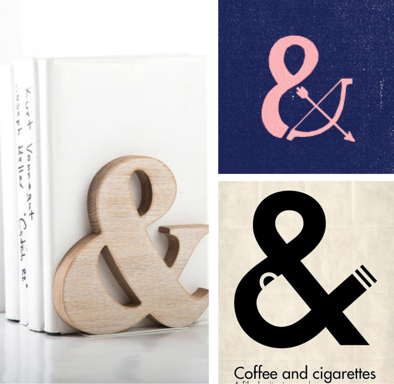
First Column : 1 /2  Second Column: 3 / 4 / 5 Third Column: 6 / 7 / 8 /

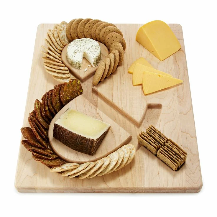
I can't resist a beautiful ampersand. I have a small collection now that you can spot around both my work desk and apartment. You can also see a few in my shop. There are so many more out there, I wish I could share them all with you! 

Here are a few more of my favorite unexpected ampersands:

The ampersand can be tracked all the to the first century AD. It was originally a ligature of the letters E and T (“et” is Latin for and). You are still  able to see the E and T separately in some of the modern ampersand. Read more on the ampersand here and here.