Links to Love: May, vol. 2

Well, May is almost finished - and it has been a good month. Birthdays, graduations, and all kinds of celebrations in between. I'm sad May went by so quickly, but I'm looking forward to a sunny June.

Here are some links I have been loving this last month:

- The National Stationery Show posts have been filling up all my feeds this past month, and I couldn't get enough! To see some of the beautiful new stationery, check out Oh So Beautiful Papers great reviews. Make sure you don't miss their Paper Party post - I just love that garland!

- With a recent inspiration from my sister redoing her apartment - I have been obsessed with  "IKEA hacks" on Pinterest - especially this bar cart one!

- In need of a good read this summer? Check out these lists here , here, & here
My favorite reads right now include Unbroken by Laura Hillenbrand,  and The Fault in Our Stars by John Green

- Rifle Paper Co. launched their wallpaper line at NNS this year, and officially to the public today. So much beauty - I'm in love!

-Think you can tell a persons age off of their first name? Maybe you can - read more about it here

- Long summer nights call for quick but delicious meals. The girls over at The Daily May have the perfect fix for this with 15 Minute Creamy Avocado Pasta. They are also giving away the cookbook the recipe comes from, The Oh She Glows Cookbook, so check it out!
 

Links to Love: April, vol. 1

Photo from Anthroplogie Blog. Photo taken by Anthroplogie.

Photo from Anthroplogie Blog. Photo taken by Anthroplogie.

This week has been full of appointments, a handful of work, and an unnecessary interruption of being down for the count yesterday with a terrible cold. Thank goodness it is Friday! Everyday seems a little closer to true spring and out of the winter woods.

Here are a few links to interest and inspire you this weekend:

-Check out the stunning Earth Day displays by Anthropologie promoting the awareness of the monarch butterfly here! See more of the window displays with #AnthroEarthDay on Instagram.

- Did you know April is National Card and Letter Writing Month? It's not too late to start writing! Join Egg Press and Hello!Lucky as they promote this great month with the #Write_On campaign.

- Hopefully this new take on the font Comic Sans, Comic Neue, will bring a positive light to this much loved to be hated font.

-This yummy Thai Frappe recipe from the ladies over at A Beautiful Mess would make a great brunch addition this weekend!

- I really enjoyed this article, 4 Reasons You Should Always Pay Designers & Developers by Jon Acuff. It had some oh so familiar truths.

-Check out these beautiful photos of Washington D.C. cherry blossoms by the talented Erica Baker of Erica Baker Photography. Does isn't make you wish these beauties were planted everywhere?

Portfolio: Lindsay's Baby Shower

Invite_ReiminkBaby.jpg

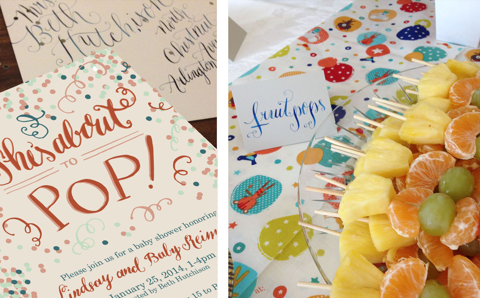
To celebrate my sister-in-law, mommy to be Lindsay and baby, my mother-in-law hosted an adorable baby shower in their honor! I was so excited to add my calligraphy to the (already) wonderful decor and joyous celebration.

Shower_Reimink.jpg
Shower_Reimink_04.jpg

Beth out did herself with her theme "She's about to Pop!"  by including all things "pop" worthy including cake pops, blow pop champagne "poppers", poppyseed muffins and so many other delicious treats!

Shower_Reimink_03.jpg

Valentines Week!

Valentines Day is Friday and I thought it would be fun to pull some fun aspects of the holiday (like the fun decor, recipes, vibrant colors, and cool crafts) and celebrate them here on the blog.

No, I have never one to go nuts for the holiday, but I do appreciate the aspect of a day to remind those we love that they are special in our lives, and shower them with pink and red candies. Winter is long enough my friends, especially this year. Why not have a fun, festive, but goofy holiday to break up the winter chill?

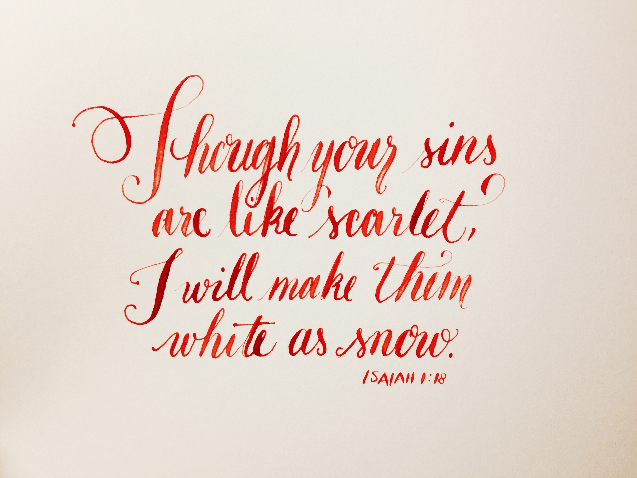
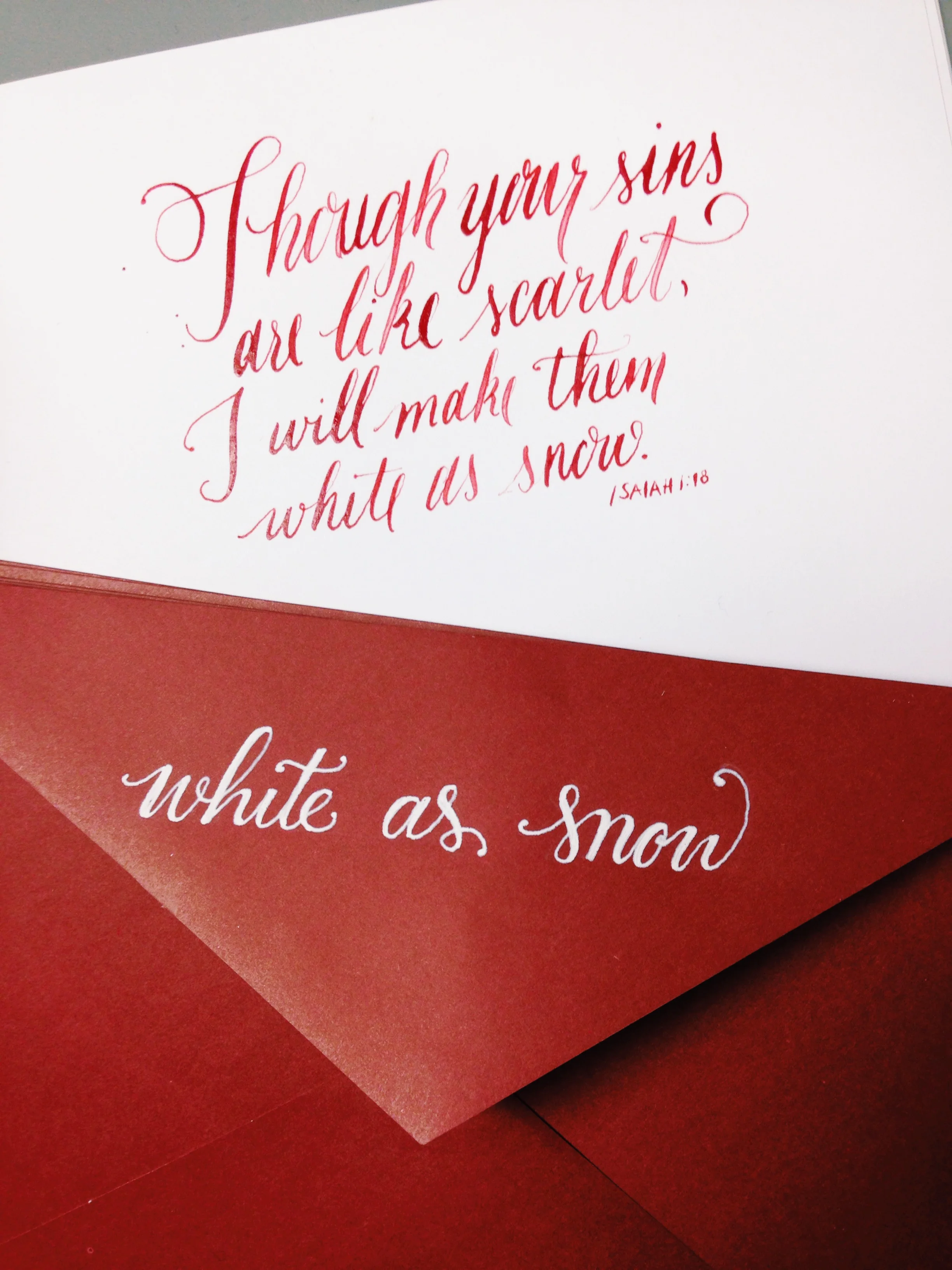
calligraphy by Linalulu Paperie

calligraphy by Linalulu Paperie

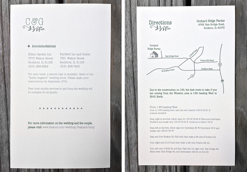
Portfolio: Aagaard Wedding | Invitation Suite

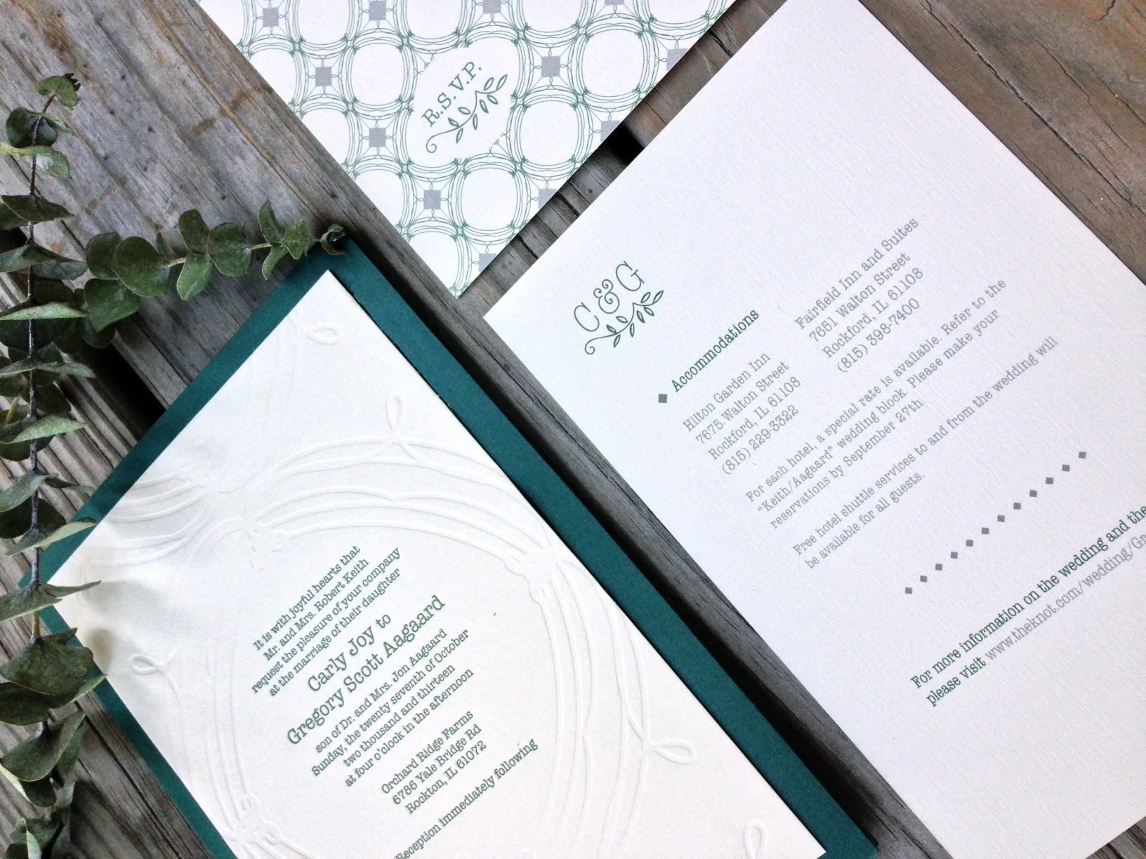
A while back I gave you a glimpse of the process I went through to come to this beautiful invitation suite, here and here.

KeithWedding_01.jpg

The bride was inspired by the mix of antique finds of her own and the bold mix of patterns seen at such stores like Anthropologie and J.Crew. With this in mind, we created a pattern and monogram that was repeated through out the suite.

InviteaCard.jpg
AagaardFullSuit.jpg

The finish product was a sweet mix of hand-done elements - like the screen printed booklet cover, and the engraved invitation- with an elegant simplicity to allow the importance of the text to shine through. The mix of the subtle but bold nature of the pattern on each piece gave a modern feel to this classic style of invite.

Life Lately in Pictures

I haven't had my iPhone long, but it has become a necessary tool in my daily design work. It is fun to to go back through and see the small fragments of memories captured in everyday pictures

Instagram_Dec2013.jpg

With Christmas and the New Year approaching quickly, there has been a lot of gift wrapping, snow shoveling, and ever increasing more work on projects for my Etsy shop (coming 2014!) I'm thankful for these small blinks of life captured, and they make me excited to share with you what is to come

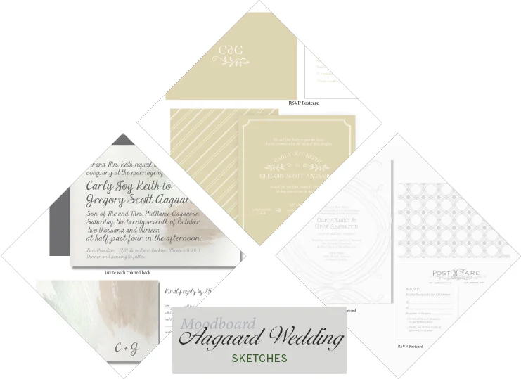
Portfolio: Aagaard Wedding | Sketches

Agaarod_Sketches.jpg

A few weeks back I shared this mood board with you from the lovely Aggaard wedding. You can see how the Mood board dictated the inspiration for the three comps I ended up showing the client. With details of a muted palette and a vintage but classic feel to the suits to match the rustic wedding she was planning, each suite captured a different mood we had talked about. The first having a contemporary look and a splash of watercolor to create color; the second being more straight cut classic, with modern vibes, and the third being a clean pallet of grey and white with a mix of patterns and vintage fonts. In the end we mixed and matched pieces from each set to create the final suite she had envisioned from the beginning. I can't wait to show you how it ended up!

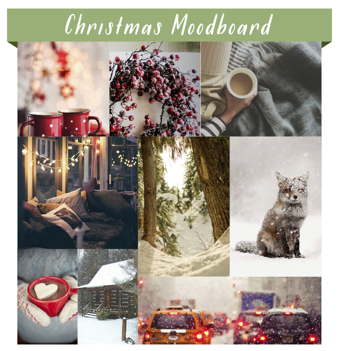
Moodboard: Christmas Season

Christmas2013_Moodboard.jpg

Top: 1 / 2 / 3 Middle: 4 / 5 / 6 Bottom: 7 / 8 / 9

Though the snow today was not a totally unwelcomed (cold) surprise in Chicago, it feels as if it is officially been proclaimed winter! With later months come Thanksgiving, and of course the season of Christmas. I know it is somewhat scandalous to think about Christmas before the Thanksgiving turkey is even plucked for the table, but it is with snow that the warm feelings of Christmas and winter come sweeping in to my mind – and of course designing our Christmas/Holiday card! I pulled some photos I have seen that remind me of how Christmas season past have felt and looked like for me, and what I want to convey in our card this year. (Plus, how cute is that snow covered fox!) The large snowflakes, the cozy lights and coco, and the steady stream of red from decorations to car lights on their way to and fro. And how about that great typeface, Frosted by Molly Jaques. It felt like a perfect cherry on top to start thinking about this years holiday season.

Artist Admiration: Dear Hancock

Image by Dear Hancock, Lookbook 2013

Image by Dear Hancock, Lookbook 2013

My humor has always had two strong hitting points: 1. Literal takes of a phrase and 2.  animals being personified in prints and drawings.   The artists behind Dear Hancock nail both of these on the head for me. Among their stationary you find whimsical and quirky interpretations of the world around them. My favorites of their work include the literal desk calendar for 2013, big happy birthday truck card, and their bunny cards (seen above). You can find this fabulous chubby bunny feature on almost a dozen different of their greeting cards. Among my favorite : Ski Bunny, Dad Bunny, and my all time favorite, Love Bunny. Doesn't he just steal your heart?

I admire Dear Hancock for the variety of simple and whimsical stationary products they offer, while continuing to update and adding to popular concepts. To me, each piece tells a loving and somewhat goofy story of these two talented artists behind the brand, and the way they see the world.

Go take a look at their new look book or follow their blog !

Image by Dear Hancock, Lookbook 2013

Image by Dear Hancock, Lookbook 2013

Portfolio: Voss Wedding Program

Front Cover to Matt and Corrie's program.

Front Cover to Matt and Corrie's program.

A sweet friend of mine, Corrie, asked me this past summer if I could help her out with the programs for her wedding. Although I didn't design her (very cute) invites, I had the opportunity to help her continue the theme and design in her programs.

It was fun to find the perfect way to display this sweet and loving couple's personality and gratitude through a tri-fold, square program that features the bridal party at the heart of the inside. Their wedding colors of corral and navy blue as well as the mix of script and serif font were a strong theme that Corrie had planned through out the rest of the wedding and the reception.

See more details of this fun program here 

Inside fold of Matt and Corrie's program

Inside fold of Matt and Corrie's program