Baby Girl Nursery Print, Water Color Calligraphy

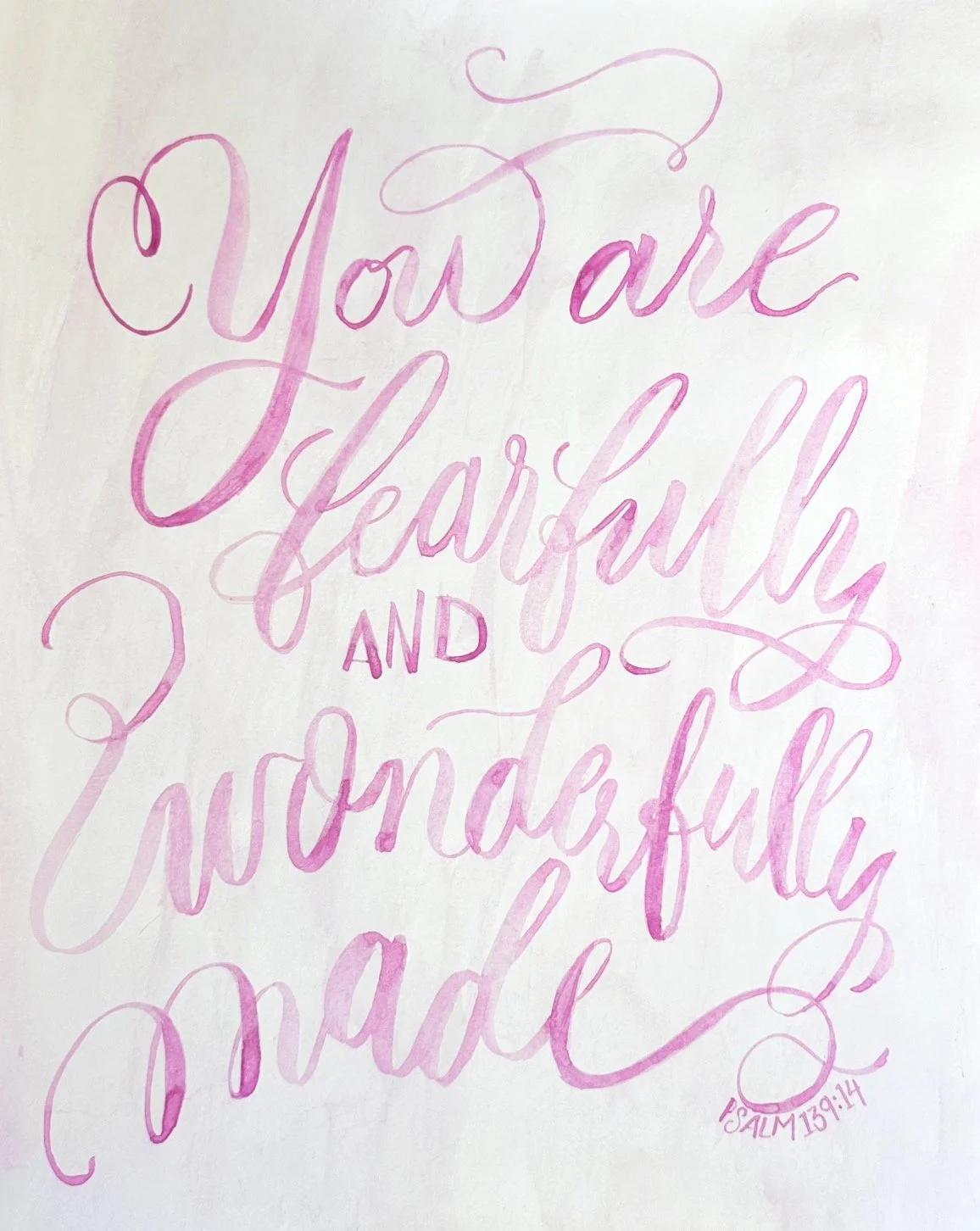
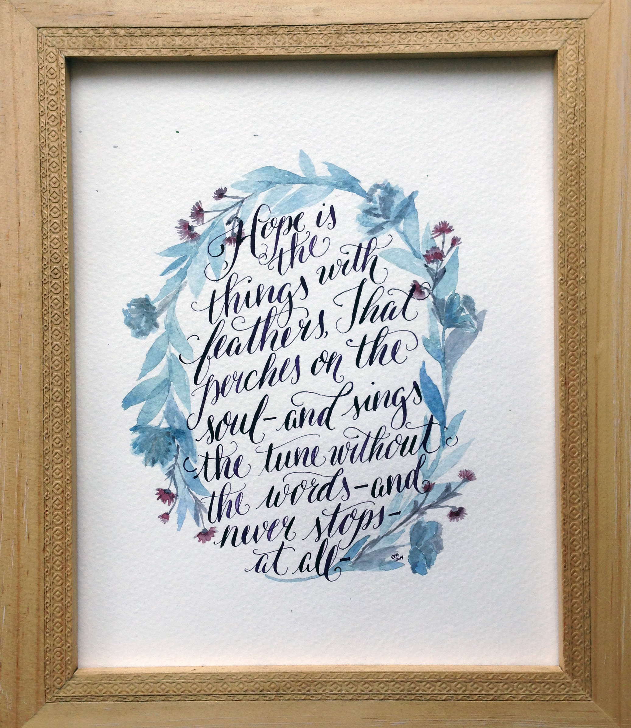
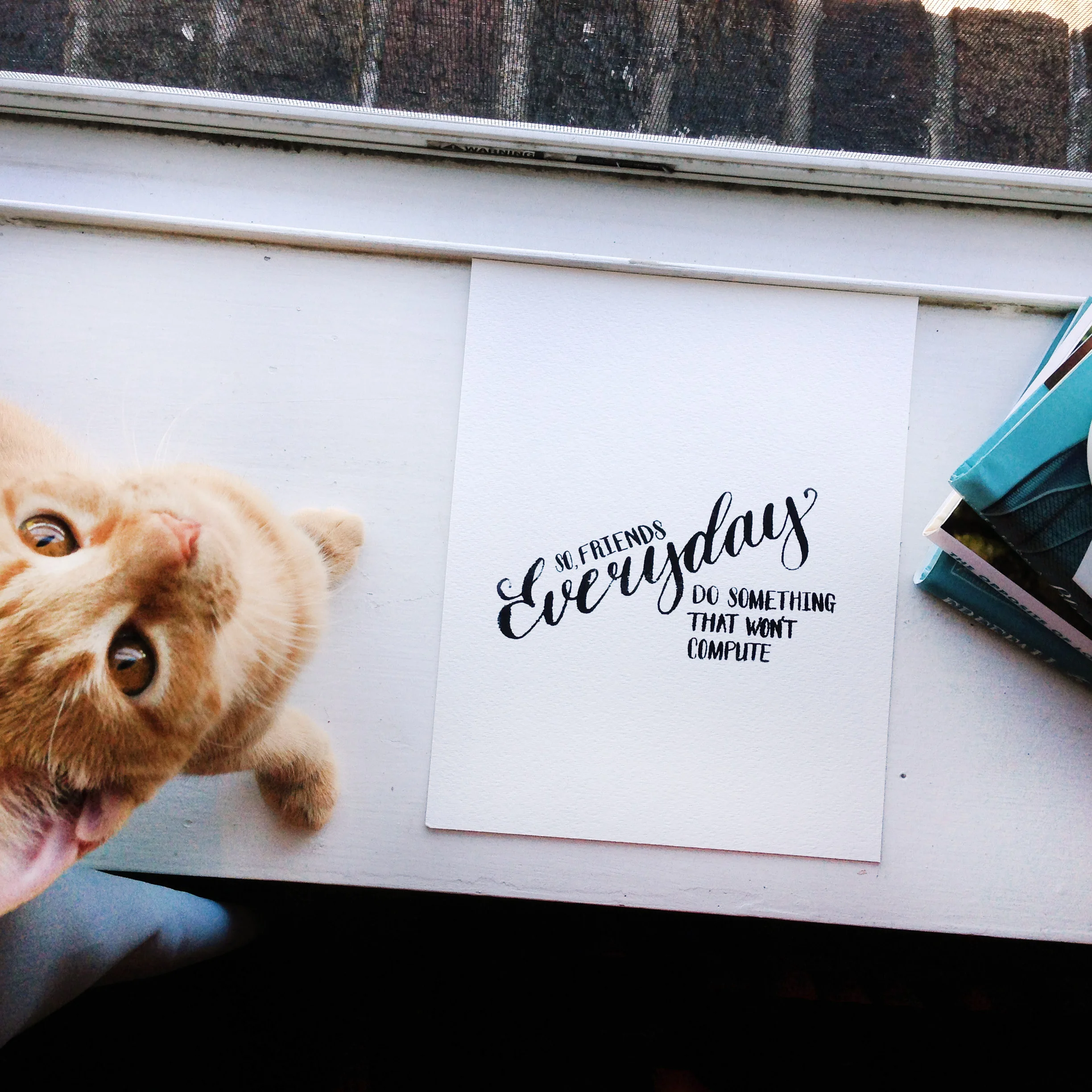
I have a handful of work that does not fit my typical wedding and live event work. It’s always piece I love and am proud of, but differ just enough from my typical offerings. This beautiful, water color and brush lettering print is just one of those pieces that could not stay hidden in my files any longer!

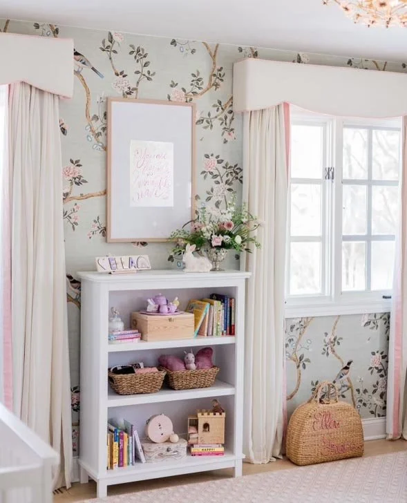
Photo by Wonder & Awe; Mary McCoy

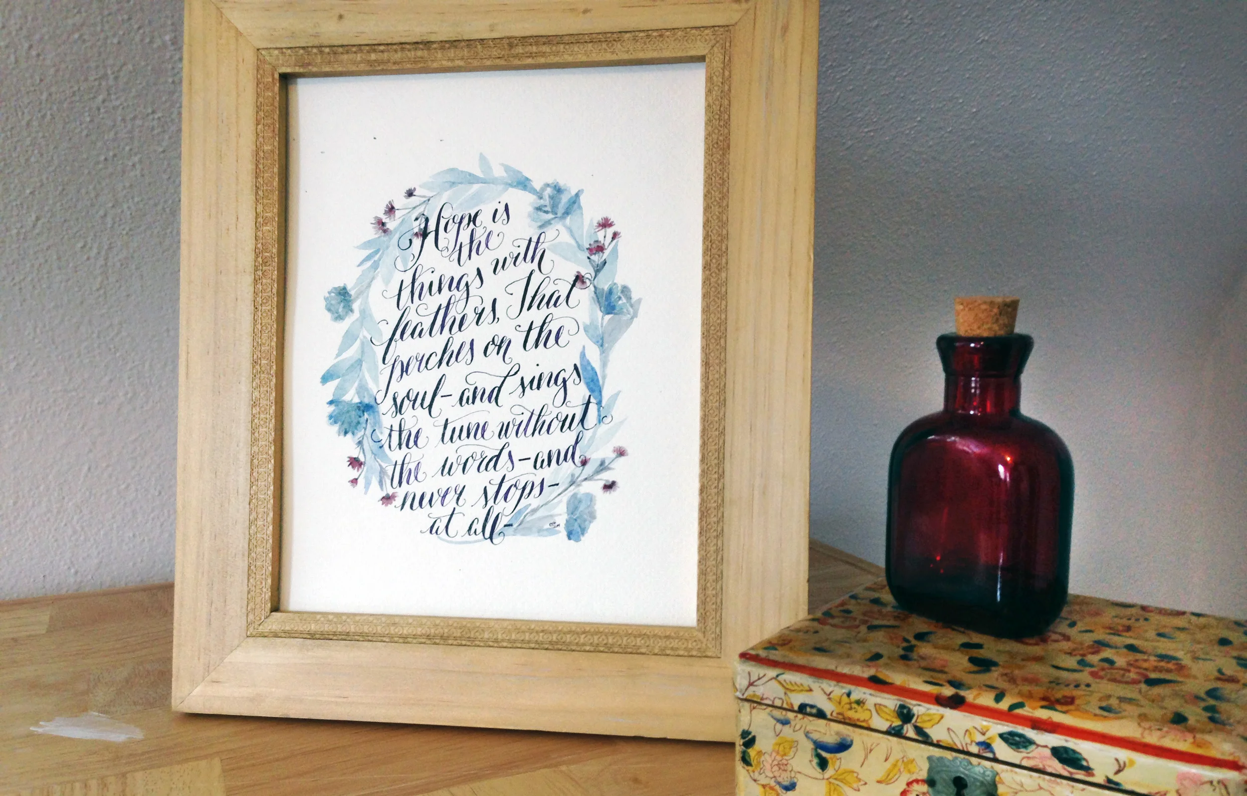
It is always an honor when someone asks me to do a print for them. It seems even more sweet when it is a print to hang in a nursery, since so many hours are usually sent by new parents in that space.

When Chelsea ask me for this beautiful brush, calligraphy verse I had to say ‘yes’.How beautiful is this room and how it fits above the bookcase? Just a gorgeous sentiment and in an already beautiful room.

Portfolio: Emily Dickinson Quote

A friend approached me to do a few prints, and among them a quote by Emily Dickinson. I learned that the quote would be a gift for her mother who had been diagnosed with Breast Cancer. The quote had brought me to tears, and with the circumstance we agreed on a softer and cooler color palette. 

I loved how the piece turned out, and often pull out my sketches and "mess ups" to look over the sweet words. I hope they both feel comfort when they reread these words, and even more comfort knowing where true hope is found. 

Portfolio: VandenBranden Bridal Shower

I did these lovely invites to honor a family friend back in the late summer. Set with a a color palette of purple, cream, and grey - I knew I wanted to keep the invite itself airy, feminine, and bright. I had been admiring the Saint Agnes font for sometime and knew that these sweet invites would be a perfect use for the elegant, but whimsical font. The combination of it all created a beautiful outcome, don't you think?

Saint Agnes is a part of the foundry Great Lake Lettering started by Molly Jacques and Dathan Boardman.


Portfolio: Heirloom Creations

I have a handful of projects I would love to show you guys - starting with these cute business cards! Lynne, a very talented crocheter, approached me to help her take her sweet creations to the next level. She has been creating and selling beautiful crocheted baby gowns, dresses, and booties for some time to friends and family, and recently stared creating adorable barretts and hair-clips.

When we sat down to go over her business cards, she knew exactly what she wanted - orange and teal that could look vintage with a whimsical nod. She told me what she liked, brought me samples of her work, and told me what she didn't want to see. I loved her clear vision and voice which made creating a few samples of cards a breeze. After tweaking things here and there, we had our fun, final product!

These cards also have a double function. Lynne will punch holes on the orange polka dot block when an order is placed for hair clips. This way she can clip them on to the card. A simple way to have all the information next to the product  for reorders. So fun!

 I know Lynne loved them just as much as I do! She is currently working on opening an Etsy shop to sell her beautiful, baby goods. I can't wait to see all her beautiful goods to come!

Giveaway Time!

Everyday_plant_sun.jpg

It feels like I have piles of work to share you all! With the rush of the holiday season, it seems this little space has been put on the back burner. With 2015 coming swiftly, I know one of my resolutions will be to put more time into updating my work.

On that same note, my dear friend from high school, Meredith Bazzoli, has written up a lovely piece on the coming of the new year and resolutions for 2015 over on her blog , Very Revealing. To accompany her fantastic post, I have worked with her on the print you see above as a fun giveaway to spark you on the road to keeping your resolutions for the new year!

Meredith writes in a matter of fact, down to earth style infused with humor that will make you feel like you have been friends for years. To enter the giveaway, jump over to Very Revealing and subscribe to her new series, Revealing Resolutions.

The new year is already being to look up!

Portfolio: Baby Berge Shower

Heatherinvite.jpg

A few weeks ago a group of ladies and myself threw a sweet baby shower for our friend and mama-to-be, Heather! This is Heather and husband, Daniel, first baby - and they are waiting to find out the sex of the child! SO brave but very fun!

We picked up on their nursery theme, Jungle Animals, and chose gender neutral colors of yellow and mint to compliment the fun animals. Heather is only a week away from her due date and we all can't wait to meet this newest little one!

See more of Heather's invite in our gallery.

HeatherInvite_02.jpg

Portfolio: Longyne/Smies Wedding

A few months back I had the pleasure of illustrating a beautiful, city inspired wedding suite for Cindy, and husband-to-be, Tyler. You can see the mini moodboard here I created when beginning this project.

CT_02.jpg

I loved hearing the passion that Cindy and Tyler have for the city of Grand Rapids, MI and how it has played a role in their relationship - and now in their wedding! We went with dark green and a grey metallic inks to bring out the scheme of their wedding. I love how the metallic ink shimmers and makes the city feel alive in the background.

Best of luck you two - I know the Lord has much in-store for you in marriage!


CT_invitetif.jpg

MoodBoard: March Projects

With Spring (hopefully) around the corner, I'm looking into more projects with fun motifs and colors. Here are little glimpses through moodboard's I have put together of somethings I have been working on!

GR_InviteMoodBoard.jpg

I'm really excited to work on this unique invitation featuring aspects of Grand Rapids, MI as the main focus for this summer wedding.

Clockwise: 1 | 2 | 3 | 4 | 5

BridalShowerAlbers_Moodboard.jpg

With wedding season around the corner, bridal shower season is in full swing. I've been itching to finish these elegant and sophisticated bridal tea invitations just so I can show you all what they pick!

Clockwise: 1 | 2 | 3 | 4 | 5 | 6

Portfolio: Aagaard Wedding | Invitation Suite

A while back I gave you a glimpse of the process I went through to come to this beautiful invitation suite, here and here.

KeithWedding_01.jpg

The bride was inspired by the mix of antique finds of her own and the bold mix of patterns seen at such stores like Anthropologie and J.Crew. With this in mind, we created a pattern and monogram that was repeated through out the suite.

InviteaCard.jpg
AagaardFullSuit.jpg

The finish product was a sweet mix of hand-done elements - like the screen printed booklet cover, and the engraved invitation- with an elegant simplicity to allow the importance of the text to shine through. The mix of the subtle but bold nature of the pattern on each piece gave a modern feel to this classic style of invite.

Portfolio: Aagaard Wedding | Sketches

Agaarod_Sketches.jpg

A few weeks back I shared this mood board with you from the lovely Aggaard wedding. You can see how the Mood board dictated the inspiration for the three comps I ended up showing the client. With details of a muted palette and a vintage but classic feel to the suits to match the rustic wedding she was planning, each suite captured a different mood we had talked about. The first having a contemporary look and a splash of watercolor to create color; the second being more straight cut classic, with modern vibes, and the third being a clean pallet of grey and white with a mix of patterns and vintage fonts. In the end we mixed and matched pieces from each set to create the final suite she had envisioned from the beginning. I can't wait to show you how it ended up!

Portfolio: Voss Wedding Program

Front Cover to Matt and Corrie's program.

Front Cover to Matt and Corrie's program.

A sweet friend of mine, Corrie, asked me this past summer if I could help her out with the programs for her wedding. Although I didn't design her (very cute) invites, I had the opportunity to help her continue the theme and design in her programs.

It was fun to find the perfect way to display this sweet and loving couple's personality and gratitude through a tri-fold, square program that features the bridal party at the heart of the inside. Their wedding colors of corral and navy blue as well as the mix of script and serif font were a strong theme that Corrie had planned through out the rest of the wedding and the reception.

See more details of this fun program here 

Inside fold of Matt and Corrie's program

Inside fold of Matt and Corrie's program

Portfolio: Aagaard Wedding | Moodboard

AagaardWedding_3.jpg

I wanted to share a little on a fun project I did a few months ago. The first part to any project is capturing the clients look and feel, i.e. mood, for what they have in mind for the end result. Some clients will have their entire vision already set and just need a designer to put together the details. For Carly, she had a great aesthetic eye, but needed a designer to create that finished product. She was fun to work with as she wanted a traditional invite, but with a unique twist. This allowed me to think outside the standard box, but keeping a classic touch.

Other details she sought out were looking for a muted palette featuring jewel tones,  and a vintage but classic feel to the suit to match the rustic wedding she was planning. The moodboard above was just a small collection to help set the tone of the suite, and I can't wait to share what we ended up creating!

Creative Quotes

Quotes_091313.jpg

This article, Unsolicited Thoughts on Unsolicited Design, by designer Matt Stevens was passed onto me by a co-worker and it struck a great nerve in me. With being fresh out of college, designing outside of work was not a common practice for the first 6-8 months from a classroom environment. Freed from classes, same student projects, and homework -  I came home at night from working a creative job for 8 hours, and all I desired was to eat dinner and stay far from my computer.  As the months went on, I noticed something different from the few times I would pick up my sketchbook and doodle outside my job versus those nights I would hardly do anything in the pursuit of "relaxing". I noticed those nights I was creative for my own sake, I felt more energized to go back to work and begin the next work day more excited to work on my "mandatory" design projects.

Overall the words rang through my ears as I read through Mr. Stevens article. Like anything one does, you make time for the things you love. Why not continue to remind ourselves as creatives why we chose design as a career path and continue to make time for creative things.